
Most SaaS pricing pages look similar on the surface, but the highest-converting ones make very different strategic decisions behind the scenes.
The way plans are structured, features are prioritized, pricing is framed, and CTAs are positioned can directly influence conversions, upgrade behavior, and revenue growth.
To understand what actually makes a SaaS pricing page effective, we analyzed 50+ SaaS pricing pages across developer tools, AI platforms, collaboration software, fintech, CRM, HR, and productivity products.
From those, we selected 20 standout examples that demonstrate strong pricing psychology, positioning, segmentation, transparency, and conversion strategy.
In this guide, we break down what companies like Slack, Notion, Vercel, and HubSpot do differently, along with the key pricing-page lessons you can apply to your own SaaS product.
What Is a SaaS Pricing Page and Why Is It Important?
A SaaS pricing page is a webpage that explains how a software product is priced, how plans are structured, what features each tier includes, and how users can subscribe or start a trial. It defines the product’s SaaS pricing model, feature access, billing options, and upgrade path.
A SaaS pricing page is important because it shapes how customers perceive product value, pricing fairness, and scalability before they buy. A clear pricing structure reduces decision friction, improves conversions, and helps users quickly identify the right plan for their needs and stage of growth.
What are the Core Elements of a High-Converting SaaS Pricing Page?
High-converting SaaS pricing pages are designed to reduce buying uncertainty. Every section should help users quickly understand who the product is for, what value they get, how pricing works, and which plan fits their needs.
Here’s what makes a SaaS pricing page convert better:
1. Clear Pricing Structure
Plans should be structured around customer size, usage, or business stage. Good pricing structures help users identify the right plan without overanalyzing feature lists.
2. Clear Plan Differentiation
Each pricing tier should communicate a meaningful increase in value. The difference between plans should feel tied to outcomes, scalability, collaboration, automation, or usage limits instead of random feature additions.
3. Strategic Feature Highlighting
Important features should be prioritized visually and contextually. High-converting pricing pages highlight the features that directly influence purchase decisions, upgrade intent, or perceived ROI.

4. Simple Pricing Experience
Elements like annual billing toggles, feature comparison tables, transparent limits, and concise FAQs reduce friction during evaluation. Simplicity improves decision speed and pricing clarity.
5. Relevant CTA Buttons
CTA buttons should match user intent and buying stage. Self-serve users may prefer “Try for Free” while larger teams or enterprise buyers are more likely to respond to “Contact Us” or “Let’s Chat”
This mirrors how buyers move through a SaaS sales funnel different stages need different conversion paths.

6. Trust and Risk Reduction
Trust signals such as customer logos, testimonials, security assurances, refund policies, and free trials help reduce perceived risk before purchase.
7. Scalability Communication
A strong SaaS pricing page explains how pricing evolves as usage, team size, or business needs grow. This helps customers understand long-term affordability and upgrade paths.
Top 20 Best SaaS Pricing Page Examples (with Key Takeaway)
The examples below aren’t just a list of names. For each one, we’ve broken down the specific plan structure, what design or copy decision makes it work, and the exact lesson you can apply to your own pricing page.
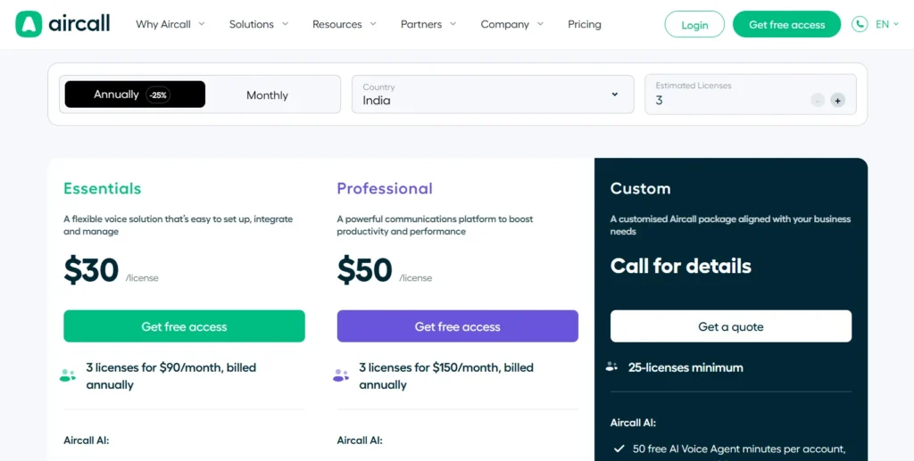
1. Aircall
Aircall structures its pricing around team maturity with Essentials, Professional, and Custom tiers. Instead of overwhelming users with massive feature tables, it highlights only the few features that actually drive plan selection, then hides the deeper breakdown behind expandable sections.
This keeps the page easy to scan while still supporting deeper evaluation for serious buyers.
The Professional plan is visually emphasized and positioned as the default recommendation, making the middle tier feel like the safest and most balanced choice.
Key takeaway: Show only the features that influence buying decisions first. Let users explore deeper details only when they need them.
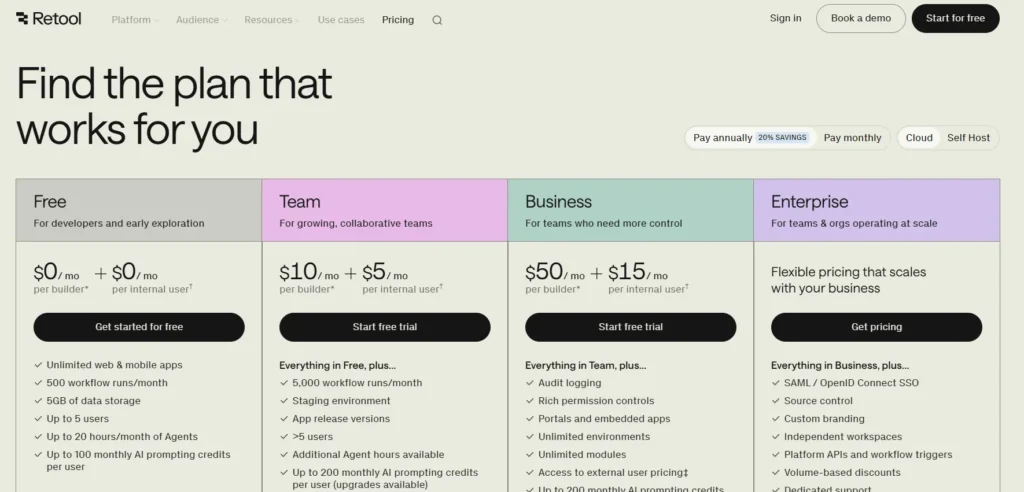
2. Retool
Retool’s pricing page speaks directly to engineers and technical buyers. Instead of generic labels like “advanced security,” it uses specific terms such as SAML SSO, SCIM provisioning, audit logs, and RBAC. This builds credibility because technical audiences evaluate precision, not marketing language.
Its free plan is also strategically generous, allowing teams to build real internal tools before hitting pricing friction.
Key takeaway: Match your pricing language to your buyer’s expertise level. Technical audiences trust specificity more than benefit-heavy marketing copy.
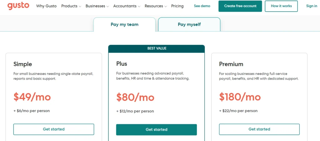
3. Gusto
Gusto designs its pricing page for non-technical business owners. Plan names like Simple, Plus, and Premium reduce intimidation and make the product feel approachable. The pricing model is also transparent, combining a base fee with a clear per-employee cost so buyers can estimate expenses immediately.
The page uses contextual microcopy to explain practical limitations and eligibility details directly beside features, reducing uncertainty without forcing users into a sales conversation.
Key takeaway: For non-technical audiences, clarity and reassurance convert better than feature depth.
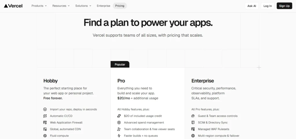
4. Vercel
Vercel separates plans by user type instead of just feature access. The Hobby plan is explicitly limited to non-commercial projects, creating a clear upgrade boundary for businesses and professional teams.
What stands out most is pricing transparency. Vercel openly displays usage limits and overage costs for bandwidth, builds, and image optimization instead of hiding scaling costs in fine print. This approach builds trust with developer audiences who closely evaluate infrastructure pricing.
Key takeaway: If your product includes usage-based pricing, make scaling costs visible upfront. Technical buyers distrust hidden pricing mechanics.
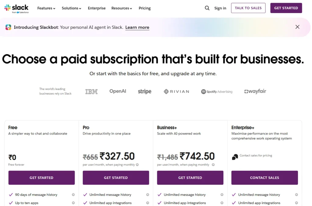
5. Slack
Slack’s pricing model is designed around natural product expansion. The free plan is useful enough for real team communication, which allows Slack to become embedded in workflows before upgrade pressure appears.
Instead of forcing upgrades aggressively, Slack relies on operational limits like message history and integrations to create upgrade intent naturally as teams grow.
Key takeaway: Strong freemium models create dependency before monetization. Users upgrade more willingly when pricing aligns with growing operational needs.
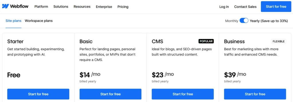
6. Webflow
Webflow separates pricing into Site Plans and Workspace Plans because its users have fundamentally different needs. Site Plans focus on hosting and SaaS CMS usage, while Workspace Plans focus on collaboration and team management.
This separation prevents freelancers, agencies, and in-house teams from evaluating irrelevant pricing information.
Key takeaway: If your product serves multiple use cases, separate pricing paths clearly instead of forcing every user through one comparison table.
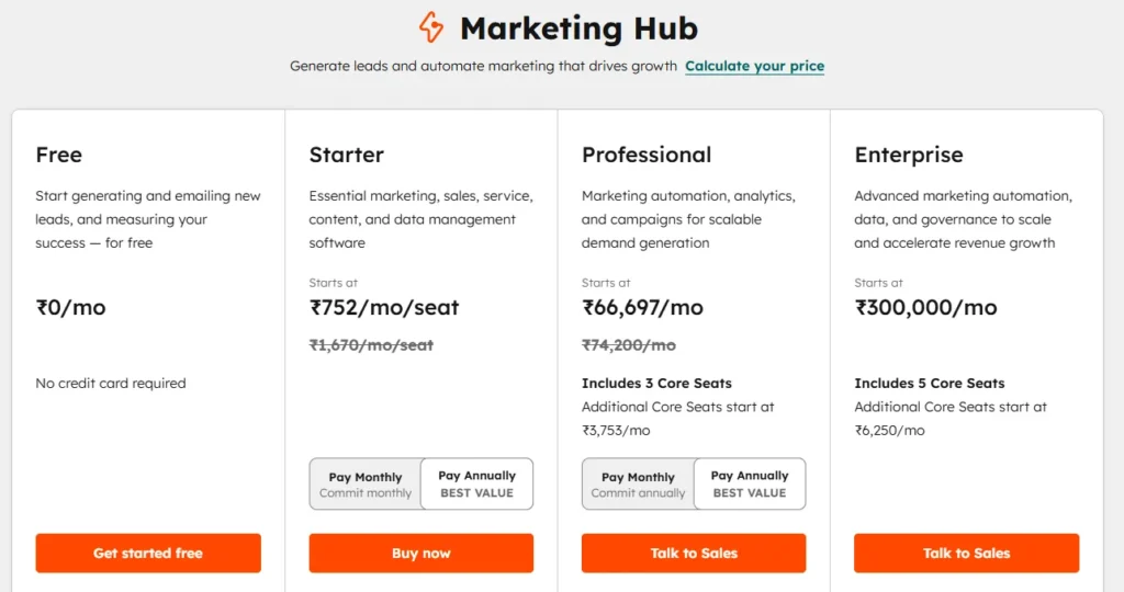
7. HubSpot
HubSpot maintains the same pricing structure across all products with Starter, Professional, and Enterprise tiers. This consistency makes a large product ecosystem easier to understand because users learn the pricing logic once and apply it everywhere.
The page also frames plans around business stage rather than feature quantity, helping buyers self-identify quickly.
This is a core principle in any B2B SaaS go-to-market strategy segment by customer stage, not just feature access.
Key takeaway: Consistent pricing structures reduce cognitive load across complex SaaS product suites.
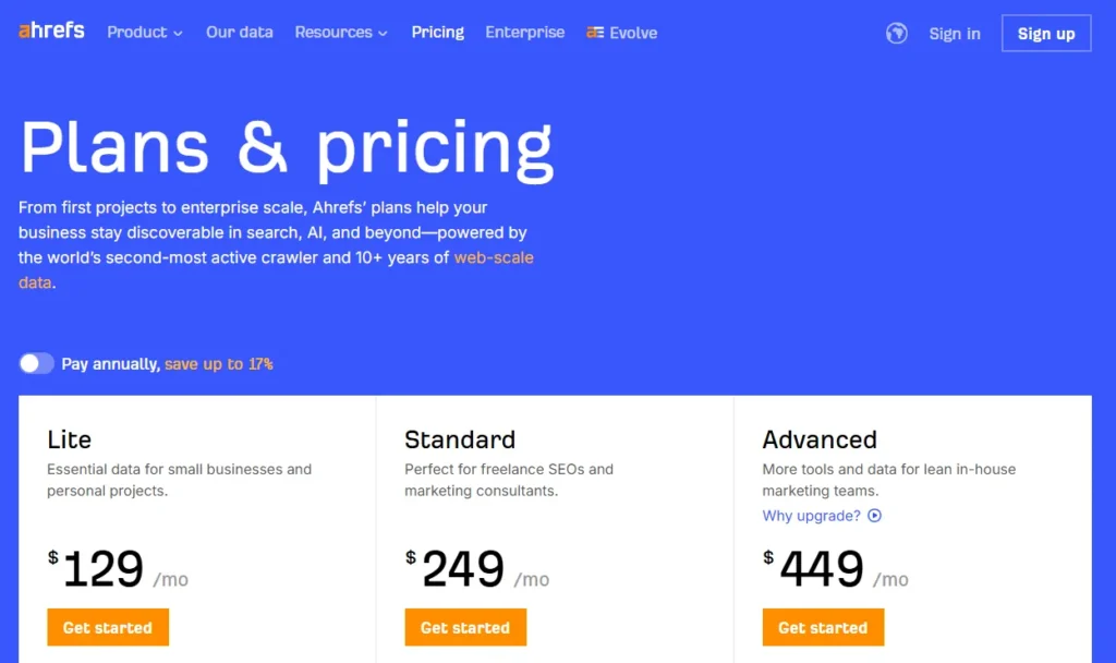
8. Ahrefs
Ahrefs prioritizes usage limits over feature explanations because its audience already understands SEO tooling. The pricing page focuses on projects, crawl credits, report limits, and historical data depth since those factors directly influence purchase decisions for SEO professionals.
The most important differentiators are visible immediately instead of buried inside feature tables.
Key takeaway: Expert users care more about operational limits and scale than basic feature descriptions.
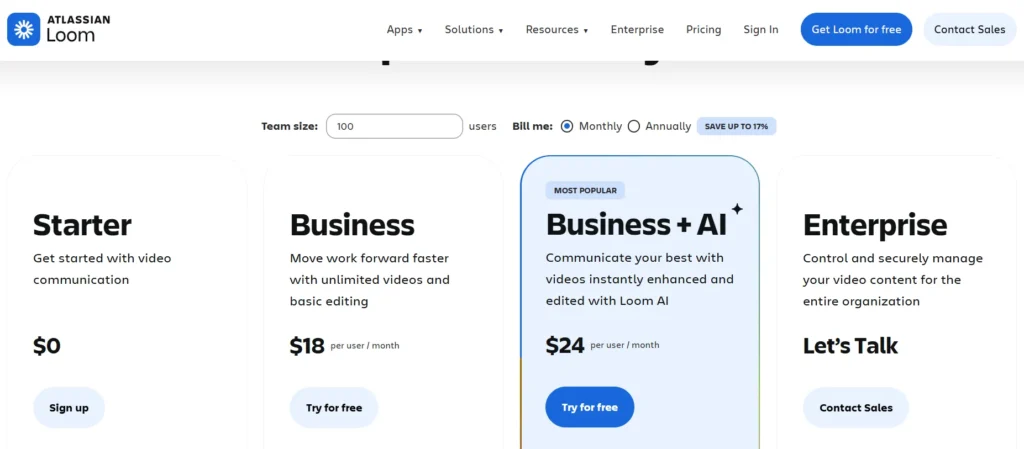
9. Loom
Loom’s pricing page clearly explains that only creators are billed while viewers remain free. This distinction dramatically changes pricing perception for teams and removes confusion around seat-based pricing.
The free plan also allows enough usage for users to build communication habits before encountering upgrade limits.
Key takeaway: If only certain user roles are billable, explain that clearly. Pricing ambiguity kills collaboration-tool conversions.
and video communication.
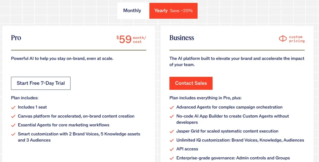
10. Jasper
Jasper structures plans around workflow type rather than team size alone. Creator is positioned for individual marketers, while Teams is framed as a collaborative content operations system.
Its most valuable differentiator, Brand Voice, is placed prominently at the top of the Teams plan, making the upgrade reason immediately obvious for marketing teams concerned about consistency.
Key takeaway: Your most commercially valuable feature should be the first differentiator users notice, not another item inside a long feature list.
11. Notion
Notion’s pricing page uses extreme visual simplicity without losing important information. Each plan highlights only the few features that actually influence upgrades, while the detailed comparison table stays lower on the page for deeper evaluation.
Its Free plan is intentionally generous, giving individuals real long-term utility instead of artificially restricted access. This turns free users into product advocates rather than frustrated leads.
The annual billing toggle is also framed as “2 months free” instead of “Save 20%,” making the discount feel more tangible and psychologically valuable.
Key takeaway: Translate discounts into concrete outcomes. “2 months free” feels more meaningful than a percentage-based saving.
12. Salesforce
Salesforce uses its pricing page to counter its reputation for enterprise complexity. Entry-level plans include explicit size signals like “for up to 10 users,” making smaller businesses feel the product is accessible to them.
The page also emphasizes business outcomes instead of software capabilities. Rather than listing features mechanically, Salesforce frames them around results like managing leads or closing deals faster.
Key takeaway: If your product feels intimidating or enterprise-heavy, use pricing copy to reduce perceived complexity and welcome smaller buyers.
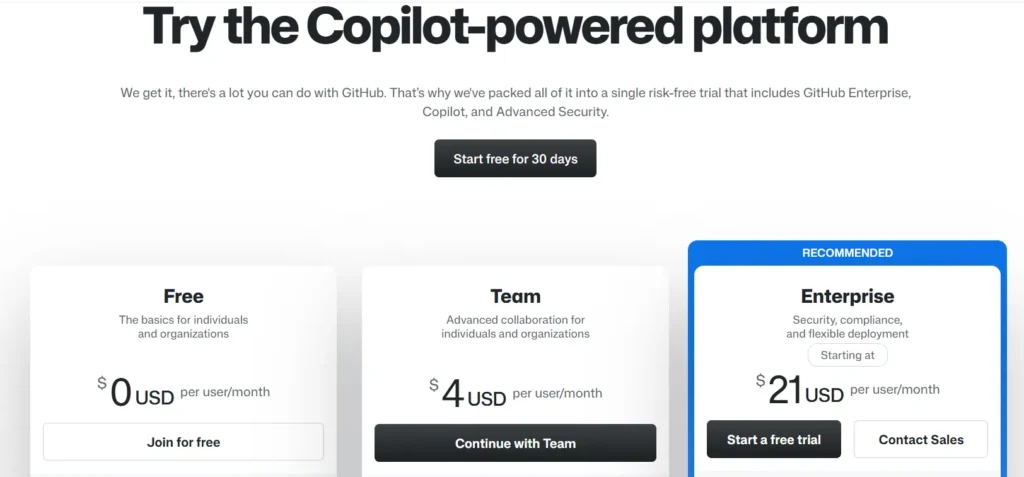
13. GitHub
GitHub separates pricing for individuals, teams, and enterprises instead of forcing every audience through the same comparison flow. This keeps solo developers focused on relevant information without unnecessary enterprise complexity.
The Free plan also receives equal visual importance because individual developer adoption is central to GitHub’s growth strategy.
Key takeaway: If your free tier drives acquisition, present it as a legitimate product plan, not a downgraded trial.
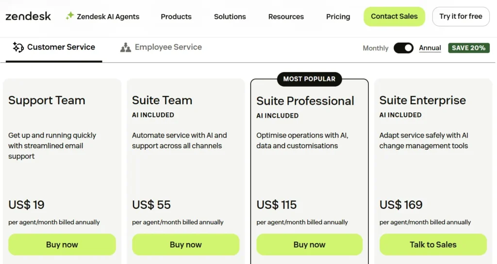
14. Zendesk
Zendesk simplifies a large product ecosystem using clear product selectors for support, sales, and service tools. This prevents users from comparing unrelated pricing categories.
A standout detail is the dual CTA structure. Each plan offers both “Free Trial” and “View Demo,” allowing self-serve buyers and committee-driven enterprise buyers to follow different conversion paths.
Key takeaway: Different buyer types need different conversion paths. One CTA rarely fits every purchasing behavior.
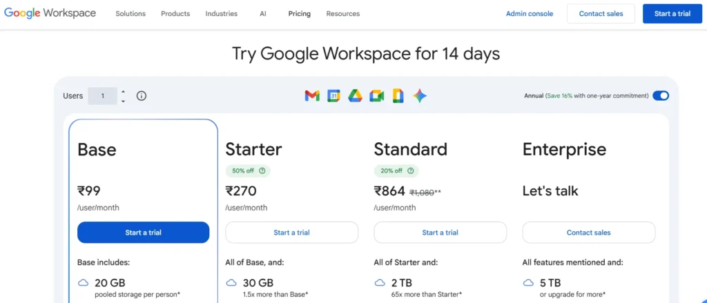
15. Google Workspace
Google Workspace relies on product familiarity and focuses its pricing page entirely on plan selection clarity. Plans are differentiated mainly through storage, meeting capacity, and admin controls because those are the real scaling factors for business buyers.
The page also uses recognizable product icons like Gmail, Drive, and Meet to reduce explanatory copy and speed up plan comparison.
Key takeaway: Strong brand familiarity allows pricing pages to prioritize selection clarity over persuasion-heavy copy.
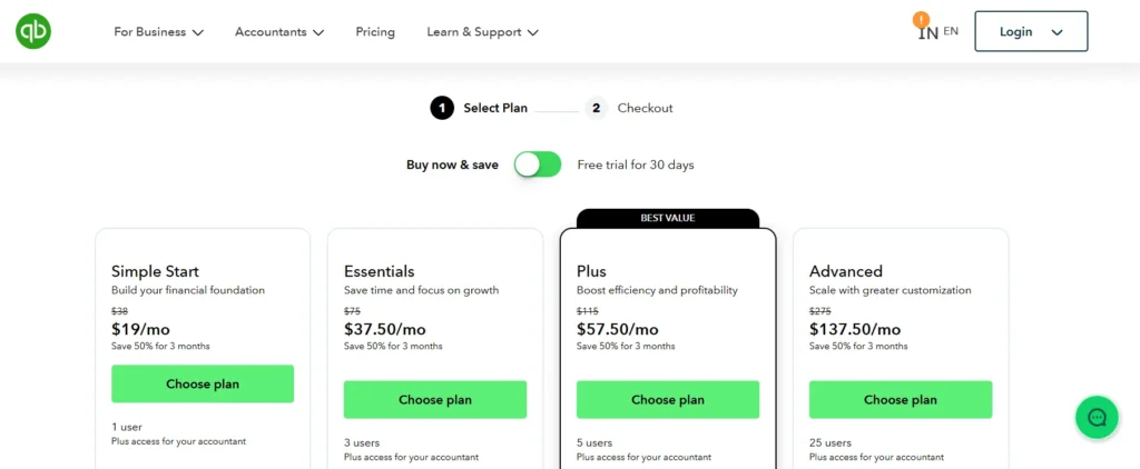
16. Intuit QuickBooks
QuickBooks reduces purchase anxiety with a visible checkout progression system showing the steps between plan selection and activation. This makes the signup process feel structured and manageable.
The pricing page also uses optional payroll add-ons instead of bundling everything into core plans, keeping entry pricing competitive while allowing expansion later.
Key takeaway: Showing buyers how many steps remain in the signup process reduces uncertainty and improves completion rates.
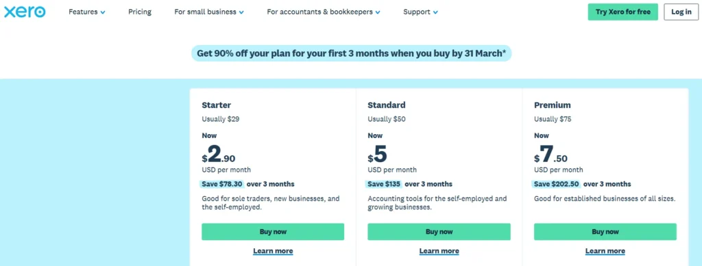
17. Xero
Xero introduces each plan by describing the type of business it serves before showing pricing or features. This immediately helps users self-identify the correct tier.
The page also highlights operational usage metrics like invoices, bills, and bank transactions because those numbers directly reflect business activity for accounting buyers.
Key takeaway: Introduce plans with customer context first. Users decide faster when they immediately recognize themselves in the positioning.
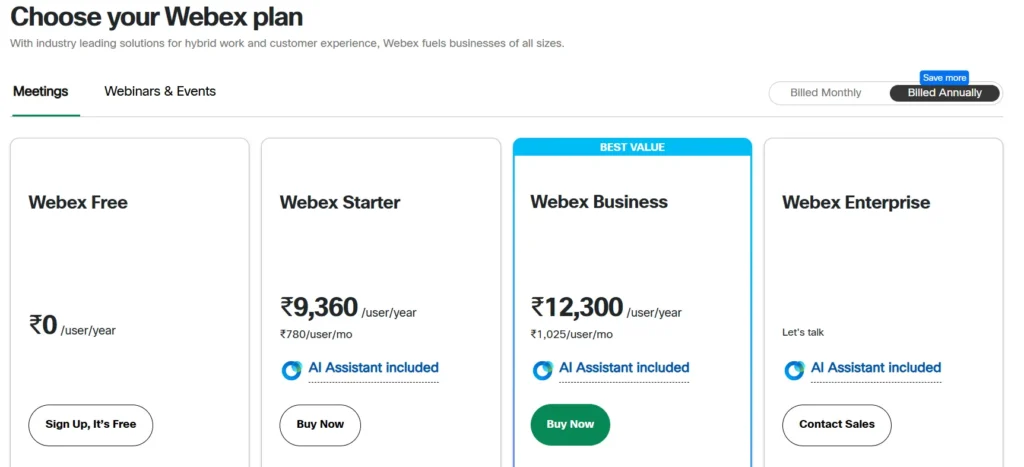
18. Cisco Webex
Webex organizes features into expandable categories like Meetings, Calling, and Messaging instead of presenting one massive feature list. This allows buyers to focus only on the functionality relevant to their use case.
The Business plan is also framed as the best-value pricing option using savings comparisons against lower tiers, helping justify higher pricing logically.
Key takeaway: Expandable feature categories reduce comparison fatigue in feature-heavy SaaS products.
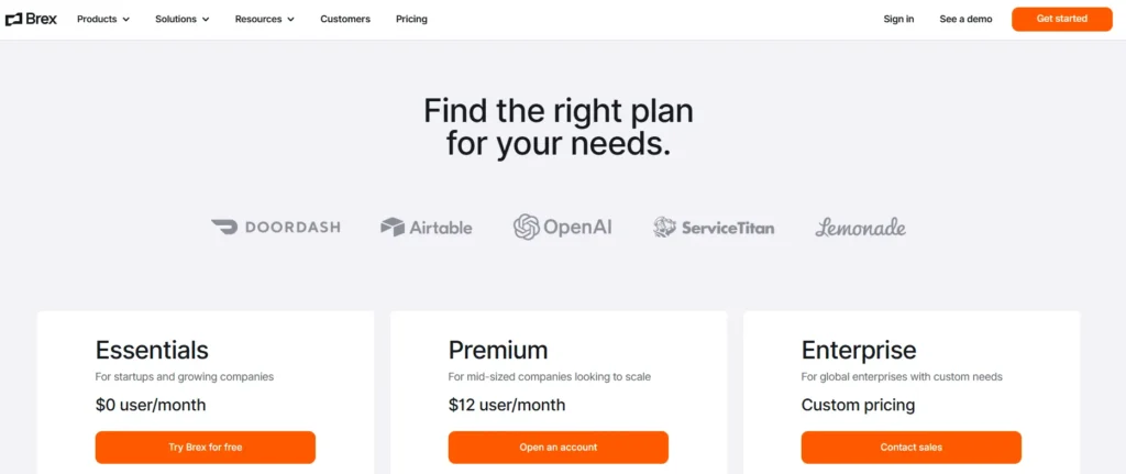
19. Brex
Brex gives unusually detailed explanations of enterprise functionality directly on the pricing page. Instead of vague enterprise messaging, it references ERP integrations, approval workflows, audit trails, and entity management capabilities upfront.
This allows finance and operations buyers to validate technical fit before entering a sales process.
Key takeaway: Enterprise buyers want enough detail to self-qualify before scheduling a sales conversation.
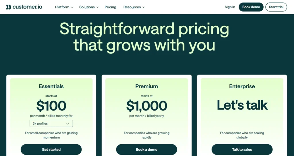
20. Customer.io
Customer.io uses highly transparent usage-based pricing centered around monthly active profiles and messaging volume. The pricing calculator updates in real time based on user input, making costs feel personalized instead of abstract.
The page also clearly separates usage pricing from workflow capability differences, helping buyers understand exactly what drives cost increases.
Key takeaway: Interactive pricing calculators improve conversion because they turn static pricing into personalized cost estimation.
How to Measure If Your SaaS Pricing Page Is Working?
Most SaaS companies redesign pricing pages visually but rarely measure whether the page actually improves plan selection, upgrade intent, or revenue quality.
A strong pricing page should not only increase conversions, but also help users choose the right plan faster and with less hesitation.
1. Pricing Page Conversion Rate
This measures how many visitors complete a primary action such as starting a free trial, subscribing, or booking a demo.
A low conversion rate usually signals one of four problems:
- The pricing structure is confusing
- The value differentiation between plans is weak
- Pricing feels misaligned with perceived value
- Users still have unresolved objections
For self-serve SaaS, conversion quality matters more than raw volume. A pricing page that converts more users into low-value plans may actually reduce long-term revenue efficiency.
2. Plan Selection Distribution
This is one of the most overlooked SaaS metrics for pricing.
You should monitor how users distribute across plans after signup.
For example:
- If almost everyone selects the cheapest tier, higher plans are not communicating enough additional value.
- If users skip the middle tier entirely, the pricing ladder is likely mispositioned.
- If enterprise demo requests are low, the enterprise plan may not clearly justify escalation.
Healthy pricing pages guide users toward intentional segmentation, not random plan selection.
3. CTA Click Distribution
Track which pricing cards receive the most CTA clicks.
This reveals which plans attract attention before users convert.
Patterns matter more than totals:
- High clicks but low conversions usually indicate pricing hesitation.
- Low clicks on higher tiers often mean the differentiators are visually weak or buried too low.
- Extremely concentrated clicks on one plan may indicate poor tier balance.
This metric helps identify whether the pricing structure itself is influencing buyer behavior correctly.
4. Scroll Depth and Reading Behaviour
Pricing pages are decision pages. Users who stop scrolling early often leave because the page failed to establish relevance quickly.
Pay attention to:
- Where users stop reading
- Whether they reach comparison tables
- Whether FAQs or trust signals are ignored
- Which sections receive repeated interaction
Long time-on-page with low conversion is usually a confusion signal, not engagement.
5. Exit Rate From Pricing Page
A high exit rate often means users reached the pricing page expecting clarity but left with unresolved uncertainty.
Common causes include:
- Hidden usage limits
- Missing implementation details
- Unclear overage pricing
- No explanation of enterprise features
- Weak trust signals
- Lack of pricing transparency
Users rarely abandon because pricing is “too expensive” alone. Most abandon because they cannot confidently justify the cost.
What to A/B Test on a SaaS Pricing Page?
Most pricing page tests fail because companies test cosmetic changes instead of decision-making friction. Focus on experiments that influence perception, clarity, and buyer confidence.
1. Pricing Tier Positioning
Test which plan receives visual emphasis.
The “Most Popular” badge strongly influences selection behavior:
- Highlighting the middle plan usually improves total conversions
- Highlighting a higher-tier plan often increases average revenue per user
- Highlighting the lowest plan can increase signup volume but reduce monetization quality
This is positioning psychology, not just design.
2. Annual vs Monthly Default
The default billing view changes price perception immediately.
Your chosen SaaS pricing model directly influences which billing default works best.
Annual billing reduces visible monthly cost and increases commitment framing. Monthly billing reduces signup anxiety for price-sensitive buyers.
The correct default depends on whether your growth priority is:
- Higher signup volume
- Better cash flow
- Lower churn
- Higher annual contract value
3. Plan Names
Generic names like “Basic” or “Pro” rarely help users self-select.
Test plan names tied to:
- Business stage
- Team size
- Workflow maturity
- Use case
Examples like “For Startups,” “Growth Teams,” or “Scale” often reduce decision friction because users identify themselves faster.
4. Feature Prioritization
Most users never read full comparison tables.
Test you have to do:
- Which features appear first
- Which features are visually highlighted
- Which differentiators appear inside plan cards
The first visible differentiator often determines upgrade perception before users compare pricing deeply.
5. CTA Copy
CTA wording changes perceived commitment level.
Examples:
- “Start Free Trial” feels standard
- “Try Free for 14 Days” feels lower risk
- “Book Demo” feels enterprise-oriented
- “Get Started” feels faster and lighter
High-performing CTA copy usually reduces perceived effort or uncertainty.
6. Usage-Based Pricing Calculators
For usage-based SaaS products, static pricing tables often create estimation friction.
Interactive calculators help users understand:
- Expected monthly cost
- Scaling impact
- Usage thresholds
- Overage pricing
Personalized pricing estimates consistently outperform generic pricing tables because buyers can map pricing directly to their own usage context.
When to Conclude an A/B Test?
Do not end tests based only on time. Pricing experiments should run until you have statistically reliable conversion data and enough volume across plan selections.
Short tests often optimize for temporary behavior instead of durable buying patterns. Also, avoid testing too many major changes simultaneously.
If pricing structure, CTA copy, and plan positioning all change together, you cannot isolate what actually improved performance.
Final Thoughts
A SaaS pricing page is more than a pricing table. It is where users evaluate value, compare plans, assess risk, and decide whether your product fits their needs.
The best pricing pages simplify decision-making through clear plan positioning, transparent pricing, strong feature differentiation, and low-friction conversion paths.
As seen across companies like Slack, Vercel, and Notion, high-converting pricing pages are built around customer psychology, clarity, and scalability rather than just design.
Ultimately, an effective SaaS pricing page should help users quickly understand three things: which plan fits them, why it is worth paying for, and how pricing scales as their needs grow.

