


When someone searches for “Your Product vs Competitor,” they’re usually close to making a decision. They’re comparing options, looking for differences, and trying to choose the right tool.
That’s where SaaS comparison pages become powerful. Instead of just listing features, these pages help buyers evaluate products, answer key questions, and understand which solution fits their needs.
A well-structured comparison page reduces uncertainty and clearly positions your product against alternatives. It can also rank for high-intent comparison keywords while guiding visitors toward a demo or free trial.
In this guide, you’ll learn how to structure SaaS comparison pages that attract decision-stage traffic and convert it effectively.
We’ll break down the key elements of high-performing comparison pages and review 10 real examples to show what works and why.
What Are SaaS Comparison Pages?
SaaS comparison pages are dedicated landing pages that compare your product directly with a competitor or alternative solution. These pages are typically designed to rank for high-intent searches like “Your Brand vs Competitor” or “Best alternative to X.”
They target buyers who are already evaluating their options. At this stage, visitors are actively comparing products to decide which one best fits their needs.
A well-built comparison page helps users evaluate key factors such as features, pricing, usability, integrations, scalability, and overall value before making a decision.
Did you know?
According to data, 70%+ of B2B buyers fully define their needs before engaging with sales. That means most evaluation happens through content like comparison pages.
Why Comparison Pages Matter in SaaS Growth
SaaS comparison pages play a critical role in bottom-of-funnel growth. They target users who are no longer exploring the category; they’re actively choosing between specific tools.
When structured properly, these pages don’t just attract traffic; they directly influence revenue.
Here’s what they help you achieve:
- Capture high-intent buyers: Users searching for “[Your Brand] vs Competitor” are close to deciding; comparison pages help you meet them at the exact moment of evaluation.
- Influence the decision stage: Clear feature, pricing, and value comparisons reduce confusion; buyers understand the differences and choose with confidence.
- Shorten the sales cycle: When key questions are answered on the page, fewer objections remain; prospects move faster toward a demo or free trial.
Understanding User Intent Behind Comparison Queries
Not all “X vs Y” searches mean the same thing. Most users are close to deciding, but their reasons differ.
Understanding this intent helps you structure pages that truly convert.
Here’s what this intent typically reveals:
- Commercial Investigation Intent: These users have shortlisted tools and are comparing pricing, features, integrations, and scalability. They want clarity and quick answers, not promotional language.
- Brand-Switching Behavior: Some visitors already use a competitor and are exploring alternatives due to pricing, limitations, or missing features. Addressing migration, onboarding, and improvements can strongly influence them.
- Problem-Aware vs Solution-Aware Buyers: Problem-aware users are validating options, while solution-aware users are comparing specific platforms. Your page should clearly explain the differences and ideal use cases for both.
- Emotional Triggers (Frustration, Pricing, Complexity): Many searches are driven by dissatisfaction. When you acknowledge common pain points and position your product as a better fit, trust increases and so do conversions.
Interesting insight:
Market research reveals 56% of B2B buyers research new vendors because the current solution doesn’t meet expectations (e.g., missing features or poor integrations), which drives them to compare alternatives.
Anatomy of a High-Converting SaaS Comparison Page
A high-converting comparison page is not just a feature table. It follows a clear structure that reduces confusion, builds trust, and guides buyers toward a confident decision.
Each section plays a specific role in moving users closer to action.
Here’s what a strong SaaS comparison page typically includes:
1. Clear, Neutral Introduction
Start with a short, balanced introduction that acknowledges both tools fairly. Avoid aggressive positioning in the opening paragraph.
Briefly explain what each platform does and why users compare them. This builds credibility and signals that the page is meant to help, not just promote.
A neutral opening lowers resistance and keeps readers engaged.
2. Quick Summary Table (Above the Fold)
Place a simple comparison table near the top of the page. This helps decision-stage users quickly scan key differences without scrolling too much.
Include:
- Core features
- Pricing overview
- Best-fit audience
- Standout strengths
This section should provide clarity in seconds and encourage users to continue reading for deeper details.
3. Detailed Feature Breakdown
After the summary table, go deeper into meaningful differences. Instead of listing features randomly, organize them around decision-making factors such as:
- Core functionality
- Ease of use
- Integrations
- Customization
Explain why these differences matter in real-world scenarios. Buyers want context, not just checkmarks.
4. Pricing & Value Discussion
Pricing is often the deciding factor. Go beyond listing plan tiers and explain value.
Cover:
- Plan comparison
- Scalability as teams grow
- Potential hidden costs (add-ons, limits, onboarding fees)
Be transparent. Clear pricing explanations reduce objections and increase trust.
5. Pros & Cons
A balanced pros and cons section increases credibility. Highlight the genuine strengths of both tools and clearly outline trade-offs.
Avoid exaggerated claims. When readers see an honest evaluation, they’re more likely to trust your final recommendation.
6. Ideal Customer Fit
Help readers self-identify. Clearly explain who should choose each tool based on company size, budget, technical requirements, and growth stage.
When users see their situation described accurately, the decision becomes easier and more confident.
7. Final Recommendation + CTA
End with a clear recommendation based on use case, not just preference. Summarize the main differences and guide the reader toward the next step.
Place a strong, action-oriented CTA such as:
- Start Free Trial
- Book a Demo
- Talk to Sales
The goal is simple: reduce uncertainty and move high-intent visitors toward conversion with clarity.
Conversion Elements That Increase Demo & Trial Signups
Small conversion improvements can significantly impact demo and trial signups. A strong comparison page doesn’t just inform, it guides users toward action.
Here are the elements that improve conversions:
- Strong Primary CTA: Place a clear, action-driven CTA like “Start Free Trial” or “Book a Demo” above the fold so decision-stage users can act immediately.
- Contextual CTAs Throughout the Page: Repeat CTAs naturally after pricing sections, feature comparisons, and final recommendations to capture users as they gain clarity.
- Migration Reassurance: Address switching concerns directly. Highlight easy onboarding, data migration support, and setup assistance to reduce hesitation.
- Risk Reversal: Offer a free trial, money-back guarantee, or no-credit-card signup to lower perceived risk.
- Strategic Social Proof Placement: Add testimonials, case studies, or recognizable customer logos near CTAs to reinforce trust at the moment of decision.
Research Highlight:
Reports show that 97% of people read online reviews for local businesses, and social proof strongly influences buying behavior. Placing testimonials or logos near CTAs increases trust at the moment of decision.
When these elements are implemented thoughtfully, your comparison page stops being just a side-by-side evaluation and becomes a structured path that confidently moves high-intent visitors from consideration to demo or trial signup.
Top 10 SaaS Comparison Page Examples
Below are strong real-world SaaS comparison pages that attract high-intent buyers and guide them toward trials or demos. Each example shows how structure, positioning, and clarity influence decision-stage users.
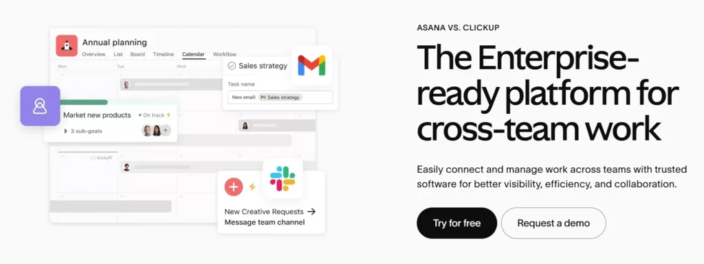
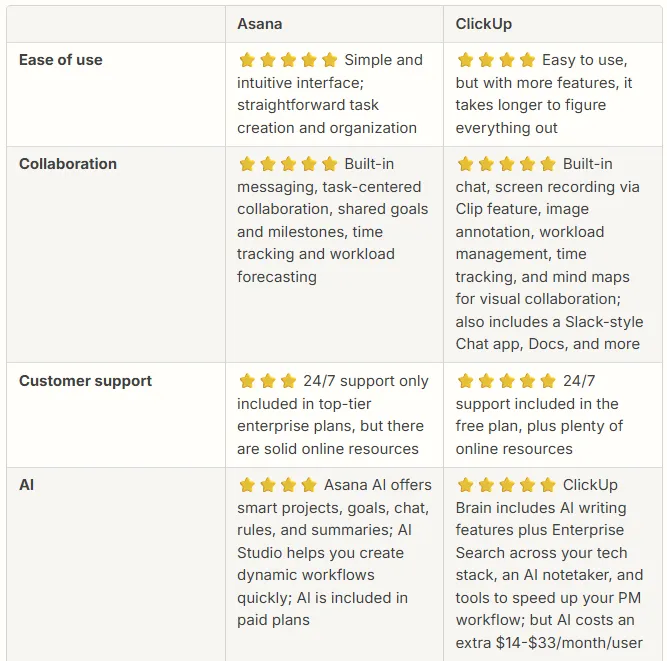
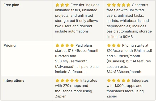
1. ClickUp vs Asana
This comparison targets teams evaluating flexibility versus simplicity in project management.
The page typically positions ClickUp as a feature-rich, all-in-one workspace while addressing common Asana limitations.
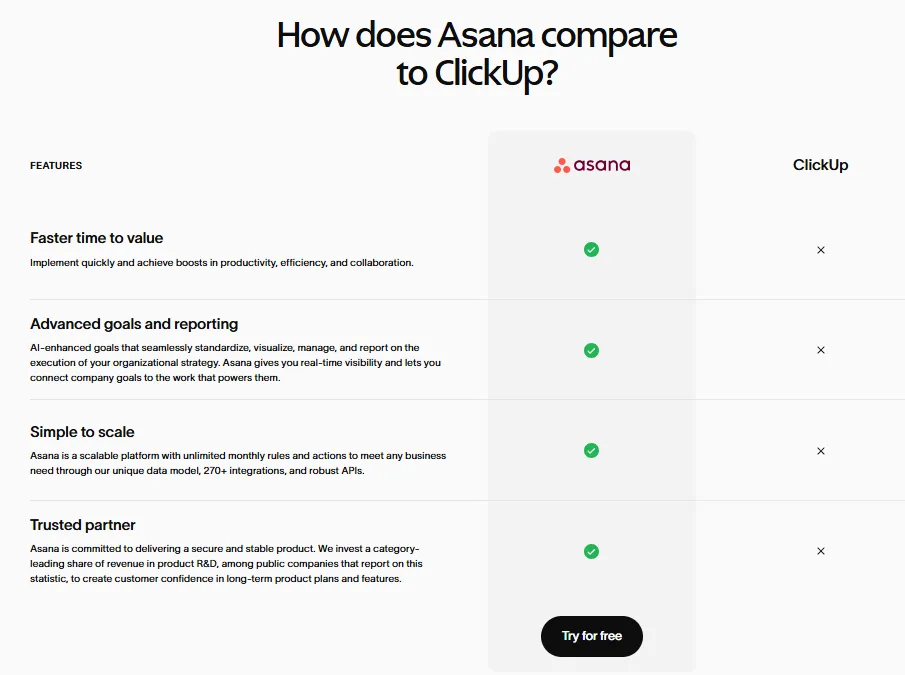
Messaging focuses on scalability, customization, and productivity gains for growing teams moving beyond basic task tracking tools.
What makes it strong:
- Feature comparison table above the fold
- Clear differentiation in automation and customization
- Migration-focused messaging
- Strong free trial CTA
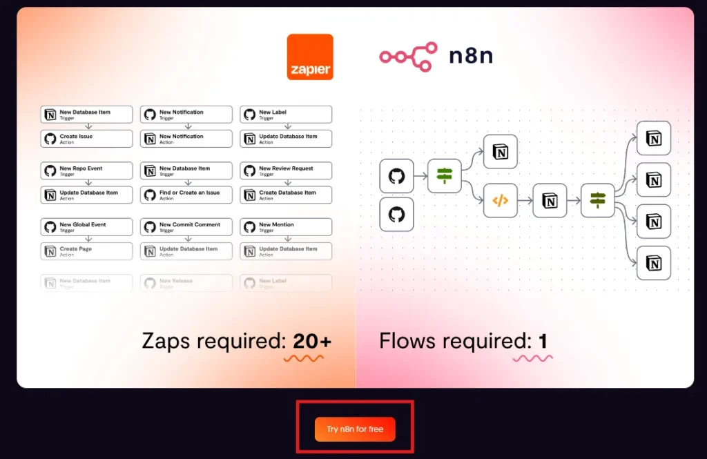
2. Zapier vs n8n
This page captures automation buyers deciding between ease of use and developer-level flexibility. Zapier’s positioning often emphasizes simplicity and integrations, while addressing n8n’s open-source flexibility.
The comparison speaks directly to scaling workflows, integration depth, and operational efficiency for growing digital teams.
What makes it strong:
- Clear positioning for technical vs non-technical users
- Integration-focused comparison
- Scalability discussion
- Contextual CTAs throughout the page
3. Zendesk vs Freshdesk
This comparison attracts customer support teams evaluating pricing, ticketing systems, and scalability. It typically breaks down automation capabilities, multichannel support, and reporting features.
The page often speaks to fast-growing businesses looking for cost-effective support software without sacrificing functionality or customer experience quality.
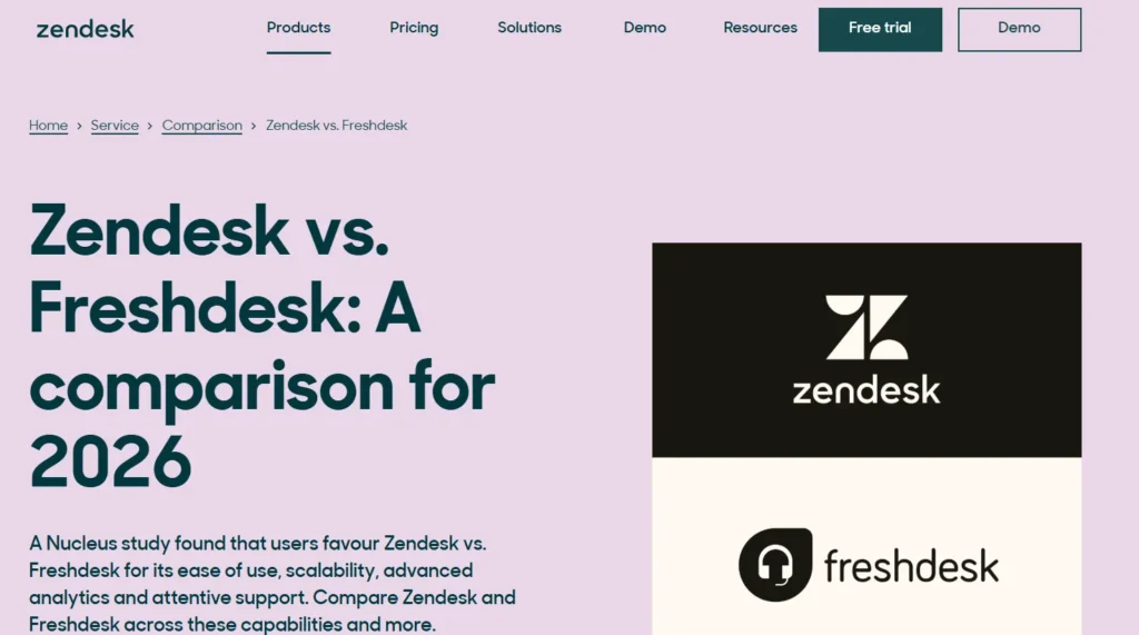
What makes it strong:
- Transparent pricing breakdown
- Side-by-side feature clarity
- Audience segmentation by company size
- Demo-driven CTAs
4. Webflow vs Squarespace
This comparison targets creators choosing between design control and simplicity.
Webflow often positions itself as the more customizable solution for designers, while acknowledging Squarespace’s beginner-friendly experience. The messaging speaks directly to creative professionals and businesses wanting more flexibility as they scale.
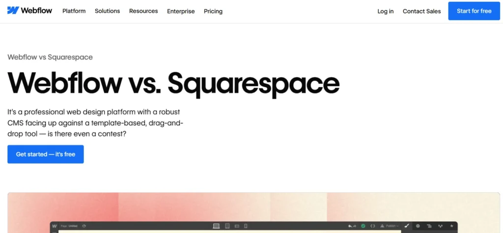
What makes it strong:
- Visual, clean layout
- Clear audience-based positioning
- Strong differentiation in customization
- Mid-page and final CTAs
5. Klaviyo vs Mailchimp
This comparison attracts ecommerce marketers comparing automation depth and revenue potential. The page usually emphasizes segmentation, personalization, and advanced workflows.
It addresses pricing scalability while positioning Klaviyo as a growth-focused alternative for brands seeking stronger revenue attribution and lifecycle marketing capabilities.
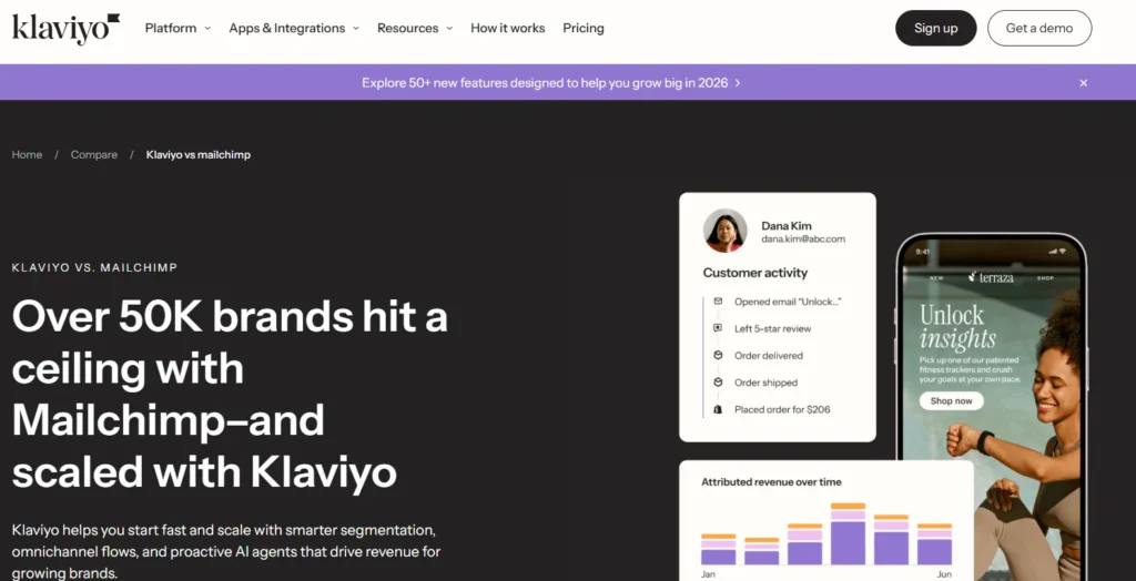
What makes it strong:
- Revenue-focused messaging
- Clear automation comparison
- E-commerce-specific positioning
- Strong trial-focused CTA
6. HubSpot vs Salesforce
This CRM comparison targets mid-market and enterprise buyers in the decision stage. It typically breaks down ecosystem strength, integrations, scalability, and total cost of ownership.
The page guides businesses evaluating complexity versus usability and highlights which solution fits specific operational needs.
What makes it strong:
- Clear company-size positioning
- Plan comparison breakdown
- Ecosystem and integration focus
- Strong demo CTA
7. Notion vs Evernote
This comparison attracts productivity users moving from basic note-taking to structured workspaces. It explains differences in collaboration, databases, and customization.
The page often positions Notion as a scalable knowledge management tool while fairly presenting Evernote’s simplicity and quick note capture strengths.
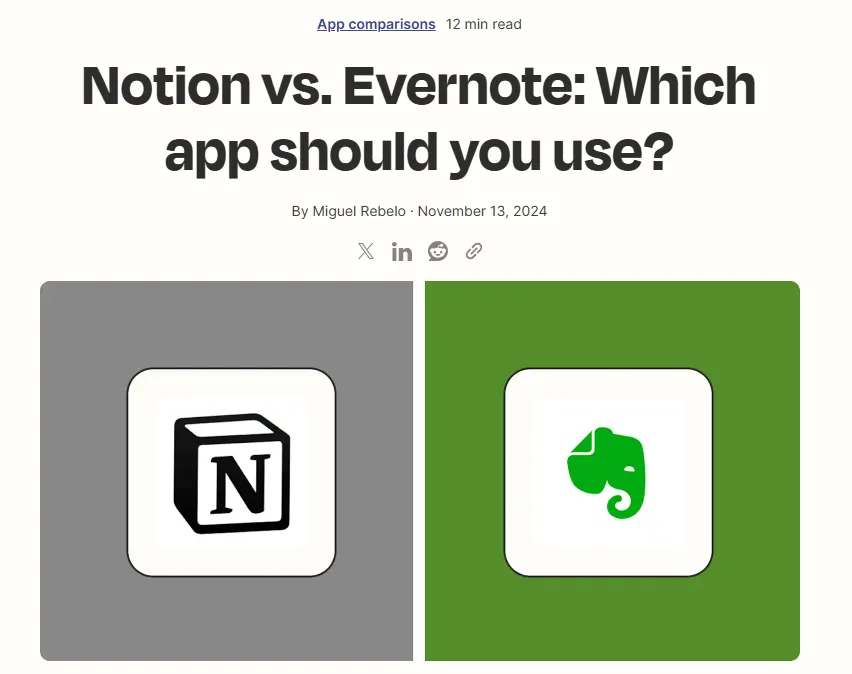
What makes it strong:
- Clear use-case differentiation
- Balanced pros and cons
- Simple, readable layout
- Free plan CTA
8. Figma vs Sketch
This design software comparison focuses on collaboration, cloud access, and prototyping capabilities.
The messaging highlights real-time teamwork and browser-based workflows, addressing designers evaluating performance, plugin ecosystems, and team collaboration efficiency in modern design environments.
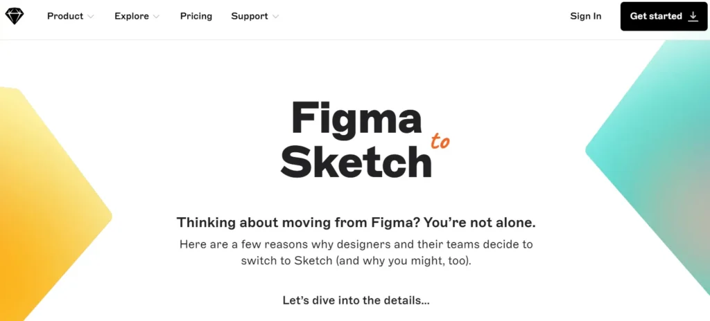
What makes it strong:
- Collaboration-focused messaging
- Clear pros and cons
- Team-based positioning
- Strong free access CTA
9. Intercom vs Drift
This comparison captures marketing and sales teams evaluating conversational marketing tools. It explains differences in chat automation, lead routing, and customer engagement workflows.
The page often positions one tool around broader customer messaging while highlighting conversion-driven features for revenue teams.
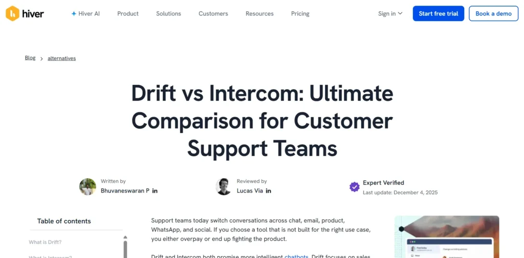
What makes it strong:
- Clear automation breakdown
- Sales and marketing use-case positioning
- Multiple contextual CTAs
- Migration reassurance
10. Airtable vs Smartsheet
This comparison targets operations and project teams choosing between flexible databases and structured project tracking tools.
The page often highlights workflow automation, collaboration, and reporting differences while guiding readers toward the platform that better fits their internal processes and scalability needs.
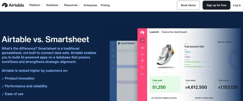
What makes it strong:
- Workflow-focused positioning
- Detailed feature grid
- Scalability comparison
- Clear free trial CTA
These examples show that high-performing SaaS comparison pages combine clarity, balanced positioning, and strategic CTAs to move decision-stage visitors toward demos or free trials with confidence.
Common Mistakes to Avoid
Even well-designed SaaS comparison pages can fail if they lack strategy. Here are the most common mistakes that reduce credibility, rankings, and conversions and how to avoid them.
Some common mistakes to watch for:
1. Thin Content with Only Tables
Many teams rely only on feature comparison tables and skip real explanations. Tables are helpful, but they don’t answer deeper buyer questions about usability, scalability, or real-world fit.
Add context. Explain why differences matter. Search engines and buyers both prefer clarity over surface-level summaries.
2. Misrepresenting Competitors
Exaggerating weaknesses or ignoring competitor strengths damages trust. Buyers researching comparisons are already informed. If your content feels biased or inaccurate, credibility drops instantly.
Acknowledge strengths fairly. Then position your product based on real differentiation. Balanced pages convert better than aggressive ones.
3. Outdated Pricing Information
SaaS pricing changes frequently. Publishing old plan details, incorrect feature limits, or outdated screenshots creates confusion and reduces confidence.
Review comparison pages quarterly. Keep pricing, features, and integrations current to maintain authority and avoid misleading visitors.
4. No Clear Differentiation
Listing features without explaining meaningful differences leaves readers unsure. If both tools appear similar, users may leave to research elsewhere.
Clarify:
- Which tool is best for
- Where your product performs better
- Which use cases align with each platform
Strong positioning shortens the decision process.
5. Overly Promotional Tone
If your comparison page sounds like a sales pitch instead of a helpful guide, readers disengage. High-intent buyers want objective information before making a decision.
Keep the tone informative and confident. Let clarity, proof, and structured comparisons guide users toward your product naturally.
Conclusion
SaaS comparison pages are more than SEO assets; they are powerful decision-stage conversion tools. When structured well, they capture high-intent traffic and guide buyers toward demos or trials.
The strongest pages balance fairness with clear positioning; using summary tables, feature comparisons, pricing insights, pros and cons, and well-placed CTAs.
If you want comparison pages that rank and convert consistently; structure and messaging matter as much as design.
Need help creating high-converting SaaS comparison pages for your product? Contact us today to discuss how we can support your SEO, positioning, and conversion strategy.
SaaS Comparison Pages FAQ’s
How many SaaS comparison pages should a company create?
A company should start with three to five comparison pages targeting its most direct competitors, especially those already ranking for “[Your Brand] vs X” keywords. Focus on competitors that influence real sales conversations and high-intent searches. After covering core rivals, expand into alternative and category-level comparisons based on search demand and revenue impact.
What CTAs work best on SaaS comparison pages?
High-intent CTAs work best on comparison pages because visitors are already evaluating options. “Start Free Trial,” “Book a Demo,” “Talk to Sales,” or “Switch from [Competitor]” tend to perform strongly. The primary CTA should appear above the fold and be repeated naturally after pricing or feature sections to guide decision-stage users.
Should comparison pages be neutral or biased toward our product?
Comparison pages should be balanced but strategically positioned. It’s important to acknowledge competitor strengths honestly while clearly explaining where your product stands out and who it is best suited for. Pages that feel fair build trust, while overly promotional or biased content often reduces credibility and conversion potential.
How do we handle feature gaps where competitors are stronger?
If a competitor has a stronger feature in a specific area, address it transparently instead of avoiding it. Explain whether that feature is critical for most users, highlight alternative strengths your product offers, and clarify the type of customer each solution is best for. Honest positioning builds long-term trust.
How do we choose which competitors to create comparison pages for first?
Start with competitors that frequently appear in sales conversations, customer feedback, and branded comparison searches. Prioritize those with strong search volume and clear market overlap. Focus first on comparisons that directly influence revenue decisions, then expand to broader alternatives that attract early-stage buyers.


