


Understanding how users interact with your website isn’t always clear when you rely only on reports and numbers.
Metrics like traffic, bounce rate, or session time tell you what is happening, but they rarely explain why users behave a certain way.
This is where heatmaps add clarity.
Heatmaps turn user interactions into visual patterns, making it easier to see where visitors click, how far they scroll, what draws attention, and what gets ignored. Instead of guessing or relying on assumptions, you can observe real behavior directly on your pages.
In this guide, we’ll cover:
- What heatmaps are and how they work
- The different types of website heatmaps
- The key benefits for user experience and conversions
- Popular heatmap tools and how teams use them
Whether you’re improving content layout, fixing drop-off points, or refining user journeys, heatmaps help you make decisions based on how people actually experience your website, not just what the data says.
What is a heatmap?
A heatmap is a visual data representation that uses colors to show the intensity of user activity. Warmer colors highlight areas with higher engagement, while cooler areas show low or no interaction.
On a website, a heatmap reveals:
- Where visitors click or tap
- How far they scroll
- Which elements attract attention
- Which sections are ignored
Did you know?
According to Microsoft’s analytics tool Clarity, heatmaps are generated quickly from real user data and can show patterns across clicks, scrolls, and attention zones to help you understand what content works and what doesn’t.
These visual insights make it much easier to validate design and layout decisions.
Instead of analyzing rows of data in spreadsheets, you can quickly see patterns directly on the page layout.
Pro tip: Heatmaps work best when combined with analytics tools. Numbers explain how much, while heatmaps explain why users behave a certain way.
4 Main types of website heatmaps
There are a few common types of heatmaps, each answering a slightly different question.
- Click heatmaps show where users click or tap, making them useful for testing CTA placement or spotting confusing design elements.
- Scroll heatmaps reveal how far visitors scroll, helping you understand whether key content or CTAs are being seen.
- Mouse movement heatmaps track cursor behavior, which often reflects where users are looking, especially when eye-tracking tools aren’t available.
- Eye-tracking heatmaps show exactly where users look on a page, offering deep insight into attention patterns.
15 Popular heatmap tools to explore
These heatmap tools help marketing, product, and UX teams visually understand how users interact with websites, landing pages, and digital experiences, making optimization decisions easier and more accurate.
1. Zoho PageSense
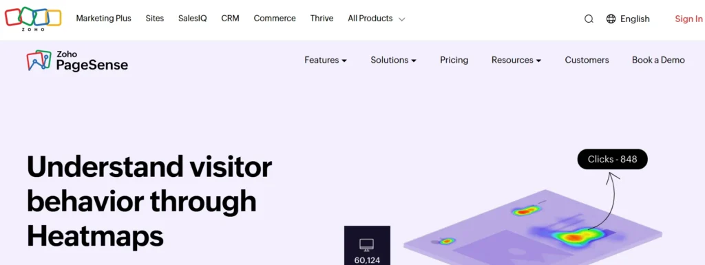
Zoho PageSense helps teams understand how visitors interact with website pages using visual behavior data.
It focuses strongly on scroll depth, attention tracking, and conversion analysis, making it useful for improving page structure, content placement, and lead capture without relying only on traditional analytics reports.
Key features
- Click, scroll, and attention heatmaps
- Session recordings
- Form analytics
- A/B testing tools
Integrations
Zoho PageSense integrates smoothly with Google Analytics, Google Ads, Intercom, and several Zoho products such as CRM, SalesIQ, Flow, and Desk, allowing teams to connect behavior data with marketing and sales workflows.
Pros & cons
| Pros | Cons |
| Strong scroll-depth insights | Limited developer-level customization |
| Good for CRO-focused teams | The interface can feel busy |
| Works well inside the Zoho ecosystem | Fewer non-Zoho native integrations |
2. Mouseflow
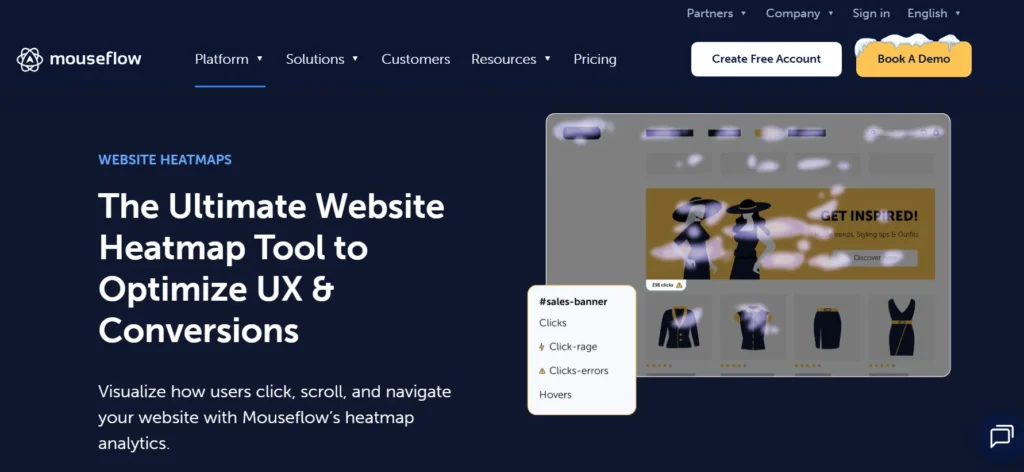
Mouseflow is a behavior analytics platform that captures how users move, click, scroll, and interact across websites.
It automatically records multiple heatmap types and session replays, helping teams identify friction points, content blind spots, and user drop-offs with minimal setup effort.
Key features
- Multiple heatmap types
- Session replays
- Conversion funnels
- Form interaction tracking
Integrations
Mouseflow integrates with tools like Google Analytics, HubSpot, Shopify, WordPress, Zendesk, Intercom, and Adobe Analytics, making it easy to connect UX insights with marketing and support data.
Pros & cons
| Pros | Cons |
| Wide range of heatmaps | Full journey analysis limited on lower plans |
| Strong filtering options | No built-in A/B testing |
| Easy implementation | Can feel data-heavy |
3. Smartlook
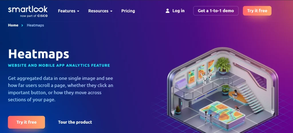
Smartlook provides real-time visibility into how users behave across websites and mobile apps. It combines heatmaps with session recordings and event tracking, helping teams quickly identify usability issues, frustration signals, and conversion barriers across platforms.
Key features
- Heatmaps and session replays
- Rage-click detection
- Event tracking
- Funnel analysis
Integrations
Smartlook connects with Google Analytics, Slack, Jira, Salesforce, Segment, Intercom, Zendesk, and Zapier, allowing teams to link behavior insights with product, support, and analytics tools.
Pros & cons
| Pros | Cons |
| Strong real-time insights | Filtering can be complex |
| Works for web and apps | Higher plans can be costly |
| Rage-click detection | Interface takes time to learn |
4. FullStory

FullStory focuses on deep experience analysis by capturing every interaction users make on a website or app. It helps teams replay sessions, search user behavior patterns, and uncover hidden friction that impacts usability, performance, and conversions.
Key features
- Advanced session replay
- Interaction heatmaps
- Conversion funnels
- Detailed behavioral search
Integrations
FullStory integrates with platforms such as Google Analytics, Salesforce, HubSpot, Segment, Slack, Zendesk, Amplitude, and Optimizely, enabling cross-team visibility into user experience data.
Pros & cons
| Pros | Cons |
| Extremely detailed insights | Expensive for small teams |
| Powerful session search | Limited mobile dept |
| Strong enterprise support | It can be complex to configure |
5. Hotjar
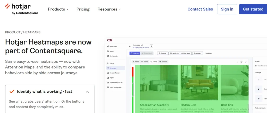
Hotjar is a popular behavior analytics tool that combines heatmaps, recordings, and user feedback. It helps teams understand not only where users click or scroll, but also why they behave a certain way through surveys and feedback tools.
Key features
- Click and scroll heatmaps
- Session recordings
- Feedback polls
- Funnel visualization
Integrations
Hotjar integrates with Google Analytics, Slack, HubSpot, Optimizely, Segment, and Microsoft Teams, helping teams pair qualitative insights with quantitative data.
Pros & cons
| Pros | Cons |
| Easy to use | No real-time tracking |
| Feedback + heatmaps together | Limited advanced attribution |
| Good for UX research | Data limits on lower plans |
6. Looker
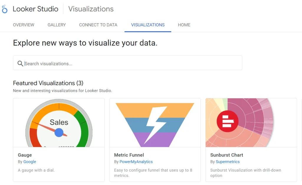
Looker is a business intelligence platform designed to analyze large datasets and visualize trends across multiple sources. While not a traditional UX heatmap tool, it supports advanced visual analytics useful for enterprise-level behavior and performance analysis.
Key features
- Custom dashboards
- Advanced data modeling
- Embedded analytics
- Collaboration tools
Integrations
Looker integrates with Google Cloud, BigQuery, Snowflake, Amazon Redshift, Salesforce, Marketo, and Zendesk, making it suitable for organizations with complex data ecosystems.
Pros & cons
| Pros | Cons |
| Powerful analytics | Very expensive |
| Scales well for enterprises | Not beginner-friendly |
| Strong visualization tools | Overkill for small teams |
7. LiveSession
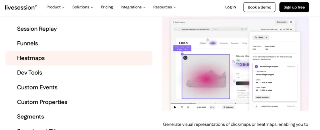
LiveSession helps teams understand how visitors navigate websites by combining session replays, heatmaps, and funnels. It focuses on privacy-safe tracking and clear visual insights to identify usability issues and conversion blockers.
Key features
- Heatmaps and replays
- Funnel tracking
- Event tagging
- Data masking
Integrations
LiveSession integrates with Google Analytics, HubSpot, Intercom, Salesforce, Segment, Zapier, Mixpanel, and Amplitude, allowing seamless data sharing across tools.
Pros & cons
| Pros | Cons |
| Strong privacy controls | No mobile app |
| Good integrations | Costly for large teams |
| Clear visual insights | Limited free plan |
8. Lucky Orange
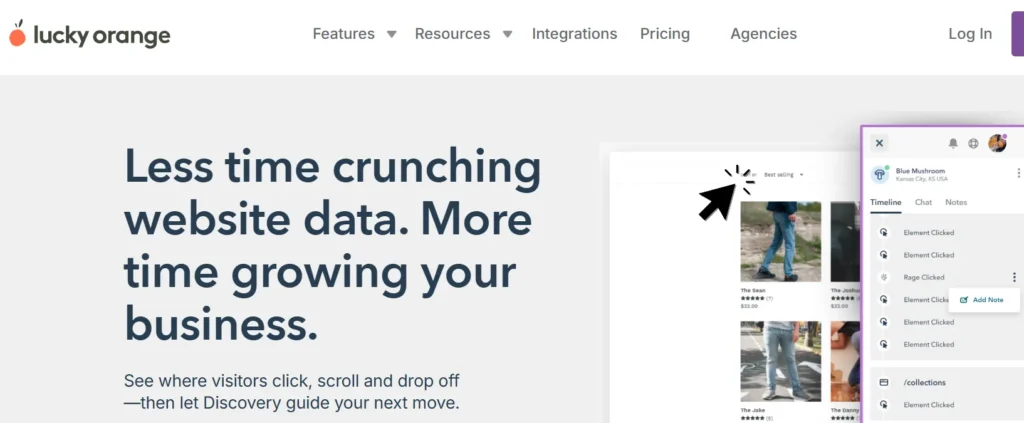
Lucky Orange focuses on real-time user behavior tracking with dynamic heatmaps and session recordings. It is widely used by marketers and e-commerce teams to improve page layouts, funnels, and conversion paths.
Key features
- Dynamic heatmaps
- Live session tracking
- Form analytics
- Conversion funnels
Integrations
Lucky Orange integrates with Shopify, WordPress, Google Analytics, HubSpot, BigCommerce, Square, and Zapier, making it suitable for ecommerce-focused workflows.
Pros & cons
| Pros | Cons |
| Real-time insights | Limited data archiving |
| Easy to use | Reporting depth is basic |
| Strong for e-commerce | Fewer advanced analytics |
9. Crazy Egg
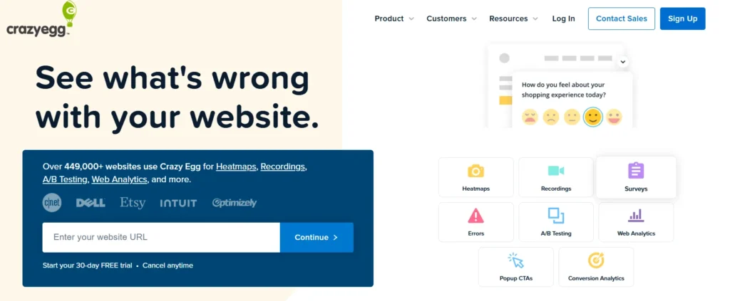
Crazy Egg is designed for teams that want simple heatmaps and quick testing insights. It helps visualize clicks, scroll depth, and attention zones while also supporting basic A/B testing for design and content decisions.
Key features
- Click and scroll heatmaps
- Session recordings
- A/B testing
- Traffic analysis
Integrations
Crazy Egg integrates with Shopify, WordPress, Wix, Squarespace, Google Analytics, Google Tag Manager, HubSpot, and Unbounce.
Pros & cons
| Pros | Cons |
| Simple setup | Heatmaps can lag |
| Good for small teams | Limited data export |
| Easy reporting | Less depth than competitors |
10. Sprig
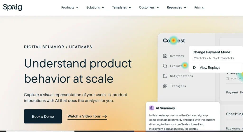
Sprig combines heatmaps, session replays, surveys, and advanced analysis to help teams understand user behavior at scale. It is often used by product teams that want deeper behavioral patterns and continuous feedback loops.
Key features
- Heatmaps and replays
- In-product surveys
- Behavior analysis
- Trend reporting
Integrations
Sprig integrates with Segment, Mixpanel, Amplitude, Slack, Google Tag Manager, Figma, Optimizely, and LaunchDarkly for product and UX workflows.
Pros & cons
| Pros | Cons |
| Strong behavioral insights | Steeper learning curve |
| Combines feedback + usage | Limited customization |
| Scales well | Higher pricing tiers |
11. MapBusinessOnline
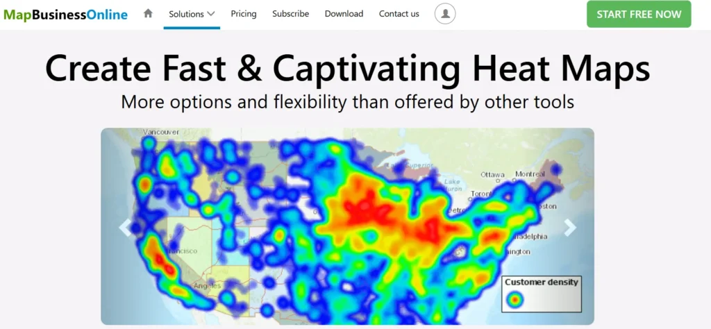
MapBusinessOnline focuses on geographic heatmaps rather than website behavior. It helps businesses analyze territories, customer distribution, and location-based performance for sales and operational planning.
Key features
- Location-based heatmaps
- Territory planning
- Route optimization
- Data layering
Integrations
MapBusinessOnline integrates mainly with Microsoft Excel and Salesforce, supporting sales and operational reporting workflows.
Pros & cons
| Pros | Cons |
| Strong geographic analysis | Limited integrations |
| Useful for sales teams | Not UX-focused |
| Easy-to-use maps | Higher cost for small teams |
12. Contentsquare
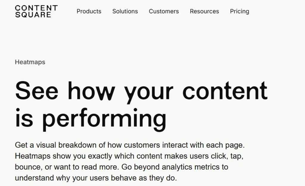
Contentsquare is a digital experience analytics platform built for large organizations. It focuses on understanding customer journeys across devices using heatmaps, session analysis, and automated insights.
Key features
- Zoning heatmaps
- Journey analysis
- Session replay
- Conversion insights
Integrations
Contentsquare integrates with Google Tag Manager, Adobe Launch, Salesforce, Microsoft Dynamics, Facebook Ads, and Google Ads.
Pros & cons
| Pros | Cons |
| Enterprise-grade insights | Pricing not transparent |
| Multi-device tracking | Complex setup |
| Automated insights | Overkill for SMBs |
13. Freshmarketer
Freshmarketer is an all-in-one marketing optimization platform designed for small and mid-sized businesses. It combines heatmaps, funnel tracking, and experimentation tools to improve conversion performance.
Key features
- Heatmaps and recordings
- Funnel visualization
- A/B testing
- Journey builder
Integrations
Freshmarketer integrates with Shopify, Segment, API tools, and marketplace apps, with additional connections available via Zapier.
Pros & cons
| Pros | Cons |
| Easy to use | Limited social integrations |
| Good for SMBs | Mobile app limitations |
| Multi-channel workflows | Less depth for enterprises |
14. Matomo

Matomo is a privacy-first analytics platform that offers heatmaps while giving businesses full control over their data. It is popular among organizations that prioritize data ownership and compliance.
Key Features
- Click and scroll heatmaps
- Self-hosted analytics
- Custom dashboards
- Privacy controls
Integrations
Matomo integrates with WordPress, WooCommerce, Drupal, Magento, Laravel, Symfony, Mailchimp, and Campaign Monitor.
Pros & Cons
| Pros | Cons |
| Strong privacy focus | Steeper learning curve |
| Full data ownership | Self-hosting complexity |
| Open-source flexibility | Setup requires effort |
15. Maply
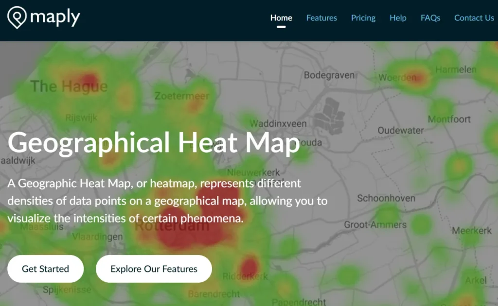
Maply is designed for creating interactive, visually engaging heatmaps for events, locations, and audience engagement. It focuses more on presentation and real-time mapping than traditional UX
behavior tracking.
Key features
- Heatmaps and cluster maps
- Real-time updates
- Custom map styling
- Route optimization
Integrations
Maply currently does not offer native third-party integrations, keeping the platform simple and self-contained.
Pros & cons
| Pros | Cons |
| Easy to use | No integrations |
| Affordable plans | Not suited for UX analysis |
| Good for events | Limited analytics depth |
What are heatmaps used for?
Heatmaps are widely used in marketing, analytics, and conversion optimization to quickly understand how users interact with digital assets.
Instead of relying only on numbers or reports, heatmaps visually show where users focus, click, scroll, or ignore on a page.
In marketing and business contexts, heatmaps are commonly used to:
- Understand how visitors interact with landing pages and key website sections
- Identify which elements attract attention and which get ignored
- Spot friction points that block conversions
- Validate design, layout, and content placement decisions
- Improve user journeys across websites, apps, and funnels
Good to know:
According to MedTech Intelligence, visual data is processed up to 60,000× faster than text, which explains why heatmaps are effective for spotting behavioral patterns instantly.
In digital marketing and UX design, website heatmaps are commonly used to:
- Identify popular click areas
- Analyze user attention zones
- Detect conversion blockers
- Improve page layout and content placement
- Optimize call-to-action visibility
One of the biggest advantages of heatmaps is their ability to highlight conversion friction, anything that stops users from completing an action.
Common friction points include:
- Hard-to-find CTAs
- Confusing layouts
- Long or unclear forms
- Poor mobile experience
- Elements that look clickable but aren’t
A heatmap instantly shows these issues without needing guesswork.
Benefits of using heatmaps
Heatmaps make user behavior easier to understand by turning complex interaction data into clear visual patterns.
Instead of relying on assumptions or raw numbers, you can see exactly how visitors interact with your pages, what attracts attention, what gets ignored, and where users drop off.
This visual clarity helps teams make confident layout and design decisions, especially when combined with broader insights like SEO ranking factors, which determine how both users and search engines evaluate your pages. Together, they help prioritize changes that improve experience and visibility.
| Aspect | Benefit |
|---|---|
| Visual clarity | Instantly shows clicks, scroll depth, and attention areas without reading long reports |
| Faster insights | Reduces time spent analyzing spreadsheets by highlighting patterns directly on the page |
| Better user experience | Helps place important content and CTAs where users naturally focus |
| Audience understanding | Reveals how behavior differs across devices, pages, and visitor types |
| Smarter design decisions | Supports layout and content changes with visible user evidence |
| Conversion optimization | Helps identify friction points that block sign-ups, leads, or purchases |
Many CRO professionals review heatmap data before running A/B tests to identify high-impact areas worth testing first.
Final thoughts
Heatmaps help bridge the gap between raw data and real user behavior. While analytics tools tell you what is happening on your website, heatmaps show how users actually interact with each page where they click, pause, scroll, or lose interest. This visual layer adds context that numbers alone can’t provide.
Over time, heatmaps help you:
- Improve user journeys by aligning page structure with natural behavior
- Increase conversions by fixing friction points and improving CTA placement
- Design with clarity by focusing on what users notice and ignore
If your goal is better engagement, smoother experiences, and more confident optimization decisions, heatmaps aren’t just helpful; they deserve a permanent place in your website optimization process.
If you’re looking to improve engagement, conversions, or overall website performance but aren’t sure where to start, the SERP Forge marketing team can help.
Contact us to discuss your goals, challenges, and next steps.