


Most SaaS landing pages look polished.
Clean UI. Sharp copy. Modern design.
Yet demo requests stay flat. Trial signups underperform. Pipeline quality feels inconsistent.
The problem usually isn’t traffic. Its structure.
Many SaaS teams build landing pages without a clear conversion framework. They rely on generic templates, copy competitors, or focus heavily on design without aligning messaging to their ICP, sales motion, and product complexity.
This guide gives you a structured, evidence-based approach to building SaaS landing pages that both rank in search and convert qualified pipeline.
If your landing pages attract visitors but fail to generate demos or signups, this framework will help you fix that.
What Is a SaaS Landing Page?
A SaaS landing page is a dedicated web page designed to convert visitors into product users or qualified leads. It focuses on a single goal, such as starting a free trial, requesting a demo, or capturing leads.
Unlike a homepage, a SaaS landing page targets a specific search intent or audience segment. It may focus on a feature, a use case, a keyword, or a marketing campaign.
Expert insight:
According to research, SaaS companies typically see a median conversion rate of around 3.8%, largely due to longer buying cycles and complex value propositions.
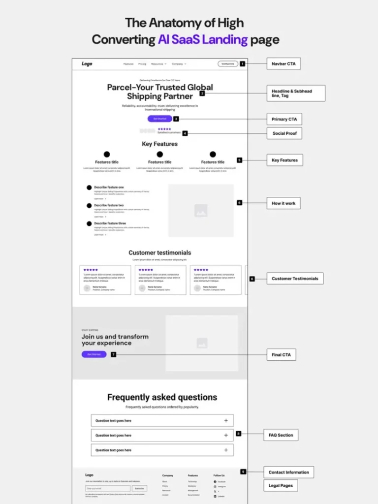
Anatomy of a High-Converting SaaS Landing Page
Before optimizing anything, you need to understand what sections actually belong on the page.
Below is a visual-style breakdown of how high-performing SaaS landing pages are typically structured:
1. Hero Section (Value Proposition)
This is the most important section on the page.
It should clearly answer:
- Who is this for?
- What outcome will I get?
- Why is this different?
Avoid vague headlines like:
“Transform Your Business”
Instead, aim for clarity and specificity:
“Automate Customer Onboarding in Under 10 Minutes.”
Add a strong primary CTA directly in the hero.
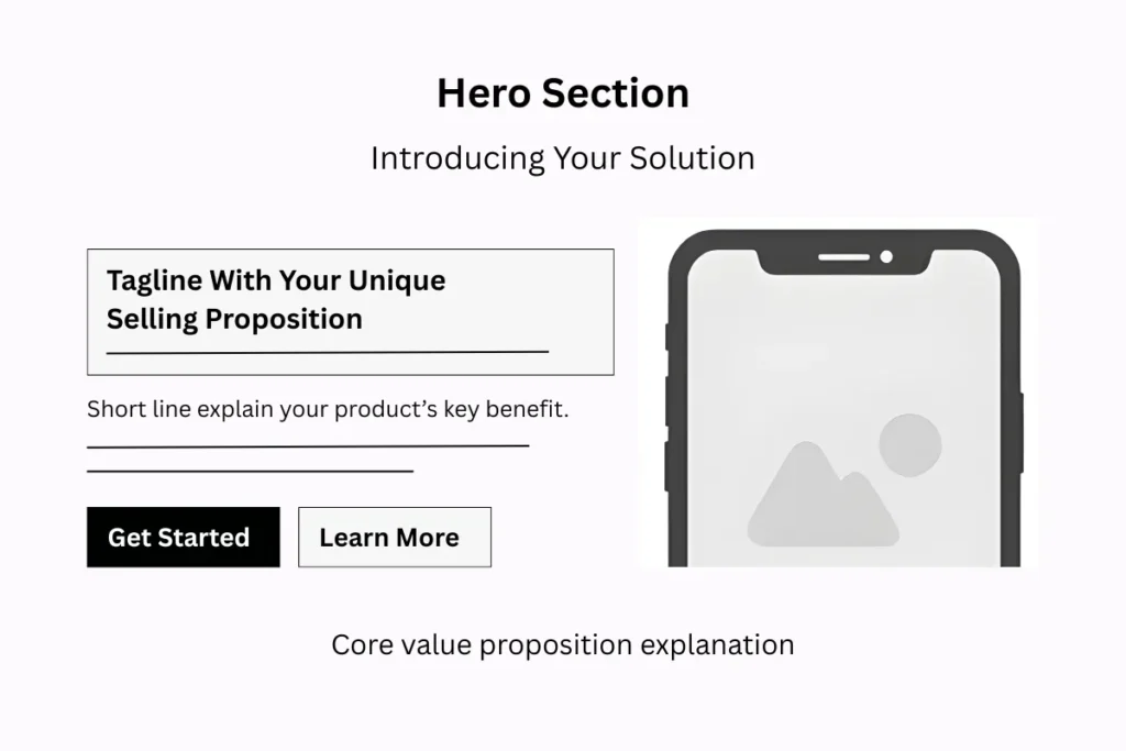
Research shows visitors form an opinion about a website in 50 milliseconds.
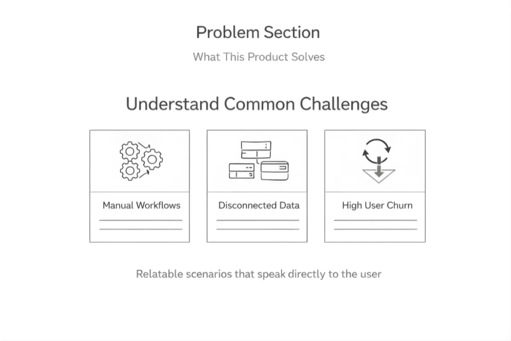
2. Problem Section (What the Product Solves)
Show visitors that you understand their real challenges.
Examples:
- Manual workflows
- Data silos
- High churn
- Slow reporting
- Poor visibility
When users feel understood, they stay engaged.
Use relatable scenarios instead of generic pain points.
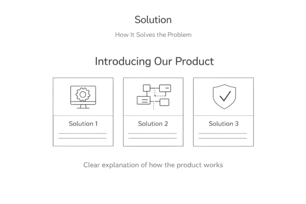
3. Solution (How It Solves the Problem)
Now introduce your product.
Explain:
- How it works
- What makes it simple
- Why is it better than current alternatives
Keep it structured and clear. Avoid technical overload unless your audience demands it.
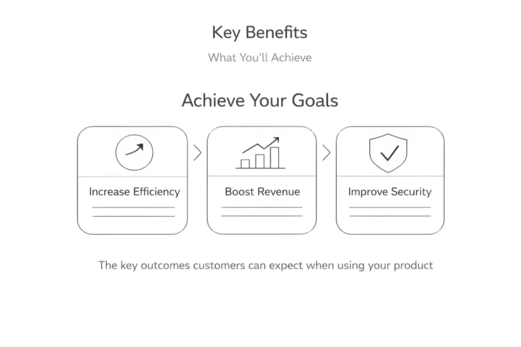
4. Key Benefits (What You’ll Achieve)
Shift from features to outcomes.
Instead of:
“Advanced automation engine”
Say:
“Reduce manual processing time by 40%.”
Outcomes build desire. Features support credibility.
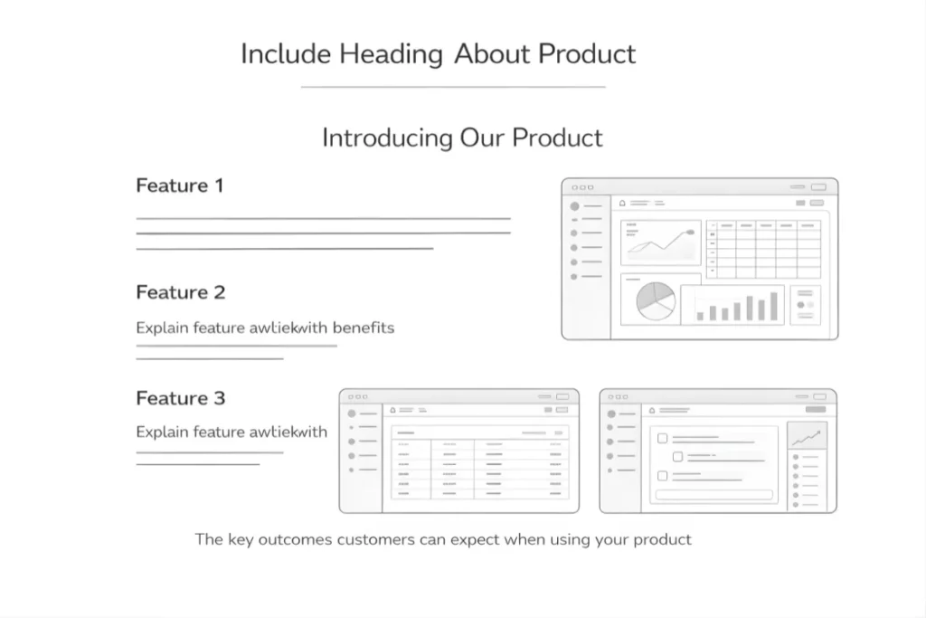
5. Product Visuals or Demo Preview
Visual content significantly improves engagement.
Show the product in action:
- Dashboard screenshots
- Short demo videos
- Interactive walkthroughs
- GIF previews
Seeing the interface reduces uncertainty and increases trust.
Did you know?
Landing pages with videos can increase conversions by up to 80%, depending on implementation.
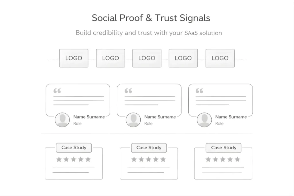
6. Social Proof and Trust Signals
Trust is one of the strongest conversion drivers.
This section builds credibility fast.
Include:
- Customer logos
- Testimonials with real names and roles
- Case study highlights
- Review ratings
Place at least some proof above the fold if possible.
According to data, 97% of people read online reviews for local businesses, and trust in reviews influences buying decisions heavily. While SaaS is B2B, trust psychology remains similar.
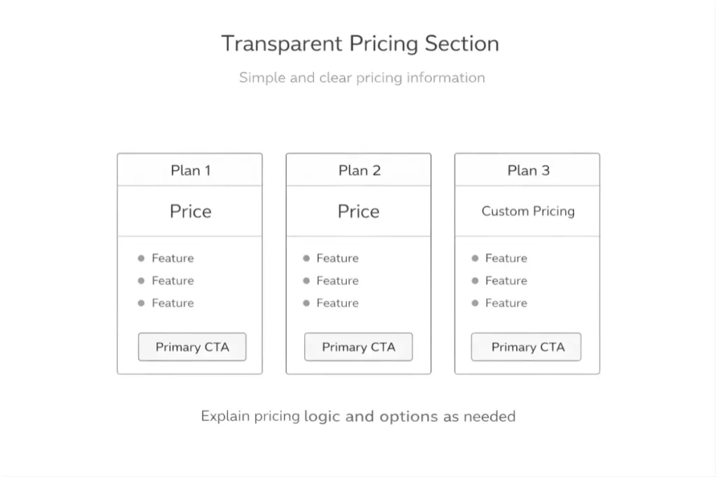
7. Transparent Pricing Section
Hidden pricing creates hesitation.
Even if you don’t show exact numbers, clarify:
- Starting plans
- Whose pricing is for
- Custom pricing logic
Transparency improves perceived trustworthiness.
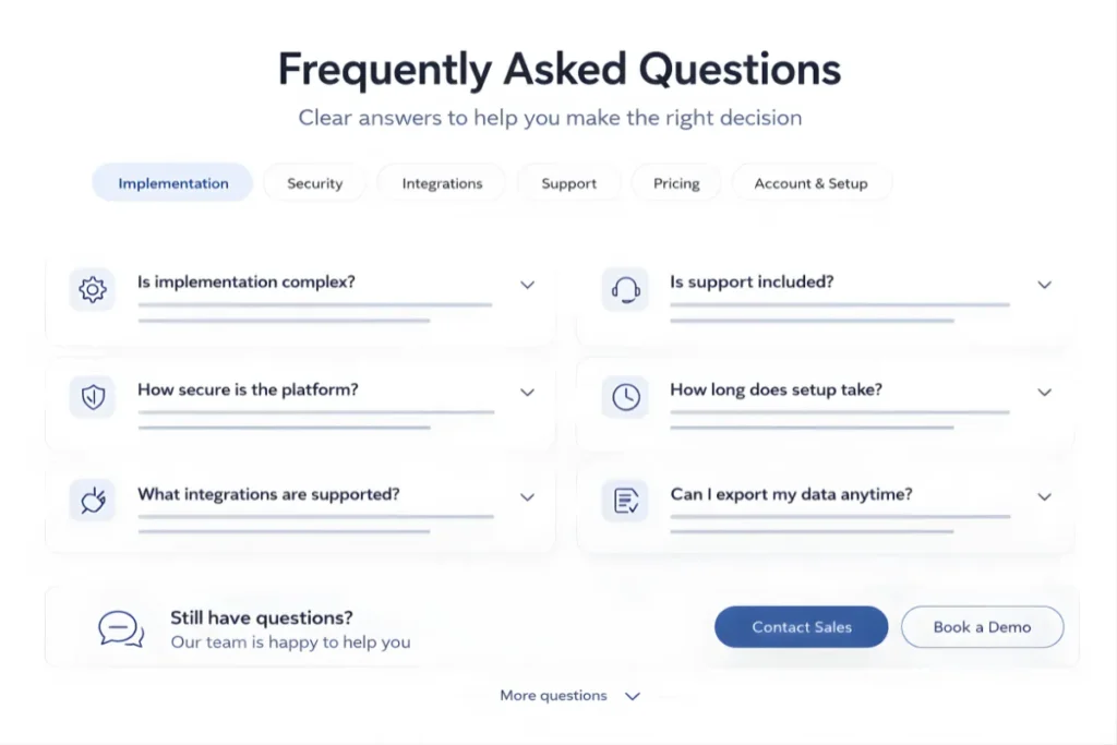
8. FAQ Section to Remove Objections
Your FAQ should address real buying friction:
- Is implementation complex?
- How secure is the platform?
- What integrations are supported?
- Is support included?
Think like your sales team. What questions delay deals?
Answer them here.
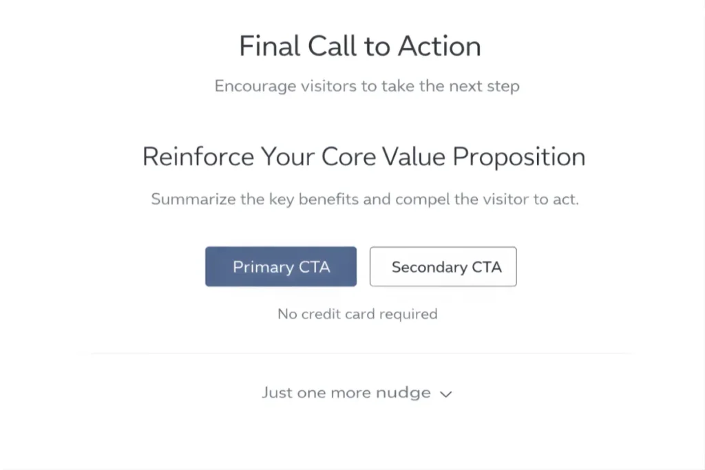
9. Final Call to Action
End with clarity.
Restate your core value proposition and reinforce one primary action:
- Book a demo
- Start free trial
- Get started
Avoid introducing new ideas here. Just reinforce the decision.
14 SaaS Landing Page Best Practices That Maximize Leads and Revenue
This is where strategy turns into results.
Below are practical, execution-level best practices you can use to improve demo requests, free trials, and a qualified pipeline, not just page aesthetics.
Here are the best practices that help SaaS landing pages convert more effectively:
1. Speak to One Primary Audience
One of the biggest reasons SaaS landing pages underperform is diluted messaging.
If your page tries to speak to:
- Startups
- Enterprises
- Marketers
- Developers
- Finance teams
…no one feels directly addressed.
What to do instead:
Pick one primary ICP per landing page.
For example:
If you sell revenue analytics software, create:
- A page for “B2B SaaS Finance Teams”
- Another page for “RevOps Leaders”
Each page should reflect:
- Their daily challenges
- Their KPIs
- Their language
- Their buying criteria
Example:
Instead of:
“Advanced analytics for modern teams.”
Write:
“Real-time revenue forecasting for B2B SaaS finance teams.”
Clarity increases relevance, and relevance increases conversion.
2. Lead With a Clear, Specific Value Proposition
Your headline should communicate value in under 5 seconds.
Avoid generic claims like:
“Transform Your Business.”
Instead, define:
- Who it’s for
- What it does
- What outcome does it deliver?
Practical formula:
We help [specific audience] achieve [specific outcome] without [common pain].
Example:
“We help customer success teams reduce churn by 20% without manual reporting.”
Specific claims feel credible and measurable.
3. Reinforce Differentiation Clearly
If visitors can’t tell how you’re different, they’ll default to comparing price.
Make your differentiation explicit.
Ask:
- Why should someone choose you over competitors?
- What’s your strongest advantage?
Examples of differentiation:
- 24-hour implementation
- Industry-specific workflows
- No-code setup
- Transparent flat pricing
- Deep integration ecosystem
Example:
Instead of:
“Powerful automation platform.”
Write:
“Deploy automation workflows in under 30 minutes with no engineering required.”
Specific differentiation reduces friction in decision-making.
4. Highlight Outcomes Before Features
Buyers care about results first.
Don’t start with:
- AI engine
- Real-time dashboard
- Workflow automation
Start with impact.
Structure your sections like this:
Outcome → Explanation → Supporting feature
Example:
“Reduce onboarding time by 40%.”
Our automated onboarding sequences guide new users through setup in minutes.
Lead with the benefit. Support with the feature.
5. Maintain Message Consistency From Ad to Page
Misalignment between ads and landing pages destroys conversion rates.
If your ad says:
“Cut Reporting Time in Half”
Your headline cannot suddenly say:
“Next-Gen Data Platform.”
The visitor clicked for one promise.
Deliver that promise immediately.
Checklist:
- Same primary outcome
- Same audience
- Same offer
- Same CTA
Consistency reduces cognitive friction.
6. Show Real Social Proof Early
Trust reduces hesitation.
Place at least one strong proof element above the fold.
Options include:
- Customer logos
- Short testimonial
- “Trusted by 1,200+ SaaS companies”
- Case study metrics
Strong example:
“Reduced churn by 18% in 3 months.”
— Head of Customer Success, Series B SaaS
Specific results outperform generic praise.
7. Use Visual Product Demonstration
Long explanations don’t convert as well as visuals.
Show:
- Dashboard screenshots
- Before-and-after comparisons
- 60-second walkthrough video
- GIF showing setup process
Practical tip:
Highlight simplicity visually.
If your product is easy, show the ease:
- 3-step setup
- Clean UI
- Drag-and-drop interface
Seeing reduces perceived complexity.
8. Address Key Objections Proactively
Your sales team already knows the top objections.
Common SaaS objections:
- “Is this hard to implement?”
- “Will my team adopt it?”
- “Is it secure?”
- “How long does onboarding take?”
Don’t wait for the sales call.
Add sections like:
- “Setup in under 24 hours.”
- “Enterprise-grade security.”
- “Dedicated onboarding support.”
Removing doubt increases action.
9. Use a Single, Focused Primary CTA
Too many CTAs create decision fatigue.
Avoid showing:
- Start Trial
- Book Demo
- Contact Sales
- Download Guide
- Learn More
Choose one primary goal per page.
For example:
If it’s high-ticket SaaS → Focus on “Book a Demo.”
Repeat it consistently:
- Hero
- Mid-page
- Final section
Clarity increases click-through.
10. Offer a Low-Risk Entry Point
Lower perceived risk to increase conversions.
Examples:
- Free trial
- 14-day no-credit-card trial
- Cancel anytime
- Money-back guarantee
- Free consultation
Example micro-offer:
“Start your free 14-day trial. No credit card required.”
Low risk encourages first interaction.
11. Reduce Friction in Forms and Signup Flow
Every extra field reduces form completion rates.
If you only need:
- Work email
- Name
Don’t ask for:
- Revenue
- Industry
- Phone number
- Company size
You can collect a deeper qualification later.
Practical test:
Cut form fields in half and measure lift.
Shorter forms often increase conversions significantly.
12. Add Microcopy Around CTAs and Forms
Microcopy removes hesitation.
Examples:
- “No credit card required.”
- “It takes less than 60 seconds.”
- “Cancel anytime.”
- “We respect your privacy.”
These small lines reduce anxiety at the point of action.
Place them:
- Under the CTA buttons
- Near form fields
- In signup confirmations
Micro-clarity improves conversion confidence.
13. Optimize for Mobile Conversion
Many decision-makers first visit from mobile.
Check:
- Is the CTA visible without excessive scrolling?
- Are the buttons large enough?
- Is the text readable?
- Does the form auto-fill properly?
Test your page manually on mobile.
Mobile friction silently kills conversions.
14. Continuously Test and Improve
High-performing SaaS landing pages are rarely built in one attempt.
Test variables like:
- Headline wording
- CTA copy
- Section order
- Testimonials placement
- Pricing display
Run controlled experiments.
Even small lifts (5–10%) compound over time.
Optimization is ongoing, not a one-time launch activity.
When applied together, these 14 practices create landing pages that don’t just look good, they generate measurable pipeline and revenue.
Common SaaS Landing Page Mistakes to Avoid
Even well-designed SaaS landing pages can underperform if core fundamentals are weak.
Below are the most common mistakes that directly reduce demo requests, signups, and qualified pipeline.
Most common mistakes to watch for:
1. Overloading with Features
Listing too many features overwhelms visitors and shifts focus away from outcomes.
When pages highlight every capability instead of prioritizing key benefits, users struggle to understand what truly matters. This increases cognitive load and reduces conversion clarity.
Focus on core outcomes first, then support them with selected features.
2. Weak or Generic Headlines
Generic headlines fail to communicate value.
If the headline does not clearly state:
- Who the product is for
- What it helps achieve
- Why is it different
Visitors lose interest quickly.
Your headline must be specific, outcome-driven, and aligned with search or ad intent.
3. Too Many CTAs
Multiple competing calls-to-action create confusion and decision fatigue.
When users see several primary actions at once, they hesitate instead of committing.
Each landing page should support one primary goal, reinforced consistently throughout the page.
4. No Social Proof
Without visible trust signals, visitors remain skeptical.
If there are no testimonials, customer logos, case results, or validation indicators, the page lacks credibility. This is especially critical in B2B SaaS, where buying decisions involve risk.
Social proof should appear early and support key claims.
5. Hidden Pricing
Lack of pricing transparency creates friction.
When visitors cannot understand cost expectations or pricing structure, uncertainty increases and conversion intent drops.
Even if pricing is customized, providing directional clarity improves trust and lead qualification.
6. Slow Load Time
Performance directly impacts both SEO and conversions.
Slow-loading pages increase bounce rates, especially on mobile devices. Heavy visuals, excessive scripts, and unoptimized assets reduce engagement before users even read the content.
Speed is a conversion factor, not just a technical metric.
Eliminating these issues often improves performance more effectively than redesigning the entire page.
Final Thoughts
Searchers looking for SaaS landing page best practices are not searching for design inspiration.
They want a repeatable blueprint.
A high-converting SaaS landing page:
- Speaks clearly to one audience
- Highlights outcomes
- Reduces friction
- Builds trust early
- Reinforces one strong action
If your page gets traffic but fails to generate qualified demos or signups, audit it against this framework.
Clarity and structure often unlock more growth than more traffic.Contact us to discuss your landing page strategy and drive higher conversions.
SaaS Landing Page FAQ’s
As long as necessary to address objections and build trust. Complex B2B SaaS often requires longer pages than simple tools.
It depends on search intent. Feature-focused pages convert better for bottom-of-funnel keywords. Broader pages work for brand or category terms.
Both. SEO brings high-intent traffic. Conversion structure turns that traffic into a pipeline.
Product-led SaaS models often perform well with free trials. Enterprise or high-ticket SaaS typically converts better with demos.
One primary CTA is repeated consistently throughout the page.
If pricing transparency is important in your market, yes. Even directional pricing builds trust and qualifies leads.
Review performance quarterly. Update messaging when positioning, ICP, or product capabilities evolve. Continuous testing should be ongoing.


